
Thinking about creating a one-page website? It’s a fantastic way to get a professional, high-impact online presence without getting tangled up in the complexity of a massive multi-page build. The real secret is focusing on a single, clear goal and using a streamlined tool to bring it all together. This approach puts your most crucial information front and center, making it dead simple for visitors to get what they need.
Table of Contents
- Why a One-Page Website Is a Powerful Tool in 2026
- Planning Your High-Converting Page Layout
- Optimizing Your Page for SEO and Discovery
- Connecting Socials and Launching Your New Site
- Common Questions About One Page Websites
Why a One-Page Website Is a Powerful Tool in 2026
With more than a billion websites out there, you don’t have much time to make an impression. A single-page site isn't just a minimalist trend; it's a smart, strategic choice for creators, freelancers, and small businesses who need to capture attention and drive action—fast.
Think about it: a focused, well-designed page guides your visitor on a straight line. Instead of getting lost clicking through different tabs and menus, they scroll through a compelling story that flows directly to your call to action. It’s a beautifully efficient model, especially for things like:
- A Social Media Hub: The perfect “link in bio” to consolidate all your profiles and content from places like Instagram and TikTok.
- Showcasing a Portfolio: Let your best work shine in one seamless, scrollable experience.
- Promoting an Event: Put all the essential details—what, where, when, and why—in one accessible spot for your next launch.
- Selling a Single Product: Funnel every bit of attention onto one key offering without any distractions.
Your Design Is Your Digital Handshake
Let's be honest, people judge a book by its cover, and they definitely judge a business by its website. Your design is often the very first impression you make, and it says a lot about your credibility. In fact, research shows that a staggering 75% of consumers judge a brand’s trustworthiness based on its website design.
With over 1.1 billion websites online, a weak first impression is a death sentence. Another study found that 38% of visitors will click away immediately if they find a site's layout unattractive. You can dig into more of this data on website design statistics and their impact on user trust.
A one-page website forces you to be disciplined. It challenges you to distill your message down to its most essential, high-impact components, which is exactly what a busy audience needs.
Just look at how a simple template from a tool like Bio Links Page Builder can be turned into a clean, mobile-first site for an e-commerce brand.
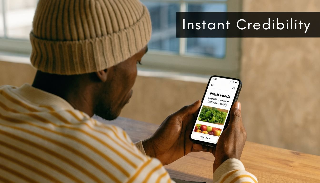
The layout here is all about visual appeal and simple navigation—two absolute must-haves for keeping mobile users from bouncing. It’s proof that you don’t need a sprawling, complicated website to look professional and get results.
Planning Your High-Converting Page Layout
Before you even think about colors or fonts, let's talk strategy. I've seen countless people dive headfirst into a page builder, only to end up with a confusing mess that doesn't convert. A little planning up front makes all the difference.
Your entire page should be built around one single, primary goal. What's the one action you absolutely need visitors to take?
- Booking a consultation call?
- Buying your flagship product?
- Subscribing to your newsletter?
- Following you on another social platform?
Everything else is secondary. Let's say you're a freelance photographer who wants to book more clients. Your main goal is getting people to fill out a contact form. Every single element on your page, from the headline to the final button, should be nudging them toward that form.
Crafting a Compelling Hero Section
You have about three seconds to grab someone's attention. That’s it. Your hero section—the very first thing people see—needs to do the heavy lifting. It must instantly tell visitors who you are, what you do, and why they should stick around.
A weak hero for our photographer might just say "Jane Doe Photography." That tells me nothing. A powerful hero section, on the other hand, would feature a breathtaking photo and a headline like, "Capturing Authentic Wedding Moments in Austin, TX. Limited 2026 Dates Available."
See the difference? It immediately establishes her niche, location, and even adds a bit of urgency. I know exactly what she offers and why I should care.
Organizing Your Content Blocks Logically
Once you've hooked them with a great hero section, the rest of the page needs to guide them on a journey. Think of it as telling a story that leads to a natural conclusion: your call to action.
A successful one-page site doesn't just list information; it builds a compelling case. Each content block should anticipate and answer a visitor's questions, moving them closer to saying "yes."
To truly drive conversions, every block needs a clear purpose. Here’s a look at the essential building blocks I recommend for almost any one-page website.
Essential Blocks for a High-Converting One Page Site
| Block Type | Purpose | Example for a Small Business |
|---|---|---|
| Hero Section | Grab attention and state your value proposition instantly. | A bakery: "Freshly Baked Sourdough, Delivered Daily in Brooklyn." |
| Services/Products | Clearly explain what you offer and what problems you solve. | A fitness coach: A grid of packages like "4-Week Kickstart" or "Monthly Coaching." |
| Portfolio/Gallery | Provide visual proof of your work and capabilities. | A web designer: A carousel of recent client website projects. |
| Testimonials | Build trust and credibility with social proof from happy clients. | A local plumber: Quotes from satisfied homeowners with their names and city. |
| About/Bio | Create a human connection and explain the "why" behind your brand. | A jewelry maker: A short story about their passion for handcrafted art. |
| Call to Action (CTA) | The final, clear instruction on what you want the visitor to do next. | A consultant: A prominent button that says "Book Your Free 15-Min Strategy Call." |
This combination of blocks creates a powerful narrative, guiding visitors from awareness to action.
Let’s apply this flow to our photographer’s page. She would move a visitor from the initial interest sparked by her hero image, to validation (seeing her portfolio), to practical details (her packages), to building trust (client testimonials), and finally to taking action with a clear call to action. This is how you turn a simple page into a client-booking machine.
Alright, you've done the planning. Now for the fun part—actually building your one-page website. If you’re using a tool like Bio Links Page Builder, you can forget about code entirely and get straight to creating. The best way to start is by picking a mobile-first template that feels right for your brand.
Think of building your page like playing with digital LEGOs. Each piece, or "block," has a specific job. The real magic happens when you start adding, rearranging, and customizing these blocks until your page tells the perfect story. This block-based approach is exactly why you can go from zero to a fully functional site in minutes.
Assembling Your Essential Content Blocks
I always tell people to start with the absolute must-haves. What’s the core information your visitor needs? Build that foundation first.
A great starting point usually includes:
- About Me/Bio: This is your handshake. Keep it short, let your personality show, and make a genuine connection with your reader.
- YouTube Video: Nothing grabs attention like video. Embedding a welcome message or a product demo here is a fantastic way to engage visitors immediately.
- Image Gallery: If you're a creative, this is non-negotiable. Let your work speak for itself with a clean, scrollable gallery.
- Product or Service Block: Make it incredibly easy for people to take action. Showcase your main offerings with clear images, simple descriptions, and direct links to buy or book.
Once these core blocks are on the page, you can drag and drop them into a narrative that makes sense. For example, a business coach I worked with moved their testimonials block to sit directly above their service packages. That simple change built trust at the most critical moment—right before the call to action. You can also toggle blocks on and off, which is perfect for running seasonal promotions or A/B testing different offers.
This visual guide breaks down how to think about your layout to guide visitors effectively from one block to the next.
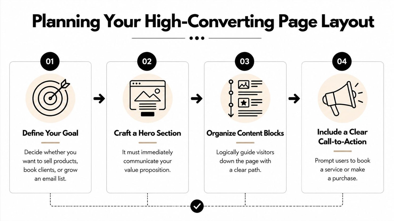
As the infographic shows, a logical flow is everything. It's what turns a casual visitor into a new customer.
Optimizing for Speed and Performance
As you start adding high-resolution images and embedding videos, you have to keep an eye on page speed. It’s a huge deal. An almost unbelievable 47% of users expect a website to load in two seconds or less. And for every second you add to that, people disappear. In fact, bounce rates jump by 32% as load times go from one to three seconds.
This is why using a page builder that automatically optimizes every block for you is a game-changer. It handles the technical stuff behind the scenes so you can focus on your content without worrying that you're slowing things down. If you want to dive deeper into the numbers, there are some great landing page performance statistics that really drive this point home.
Think of yourself as a storyteller. Each block is a new paragraph, leading your visitor through a seamless narrative that ends with your call to action.
By focusing on this block-by-block method, you're ensuring every single element on your page serves a purpose. The end result is a polished, professional site that's built to convert.
Optimizing Your Page for SEO and Discovery
Let's bust a common myth right away: a one-page website doesn't have to be an SEO ghost town. I've seen countless creators assume a single URL can't possibly rank, but that’s simply not true. You just have to prove your page's worth with rich, helpful content.
The trick is to stop thinking of it as one short document and start treating it as a hub of in-depth sections. Every block you add—from your bio and service descriptions to your product galleries—is a chance to weave in relevant keywords and directly answer the questions your audience is typing into Google.
For instance, a photographer shouldn't just have a block that says "wedding photos." That’s a missed opportunity. Instead, they should use that space to detail their specific style (like "candid, photojournalistic wedding photography"), list the locations they serve, and paint a picture of the experience they offer.
Build Authority with Content Depth
Google’s main goal is to give users the most comprehensive answer to their questions. While your one-page site lacks the architecture of a multi-page blog, you can absolutely signal that same level of authority by being smart with your content blocks.
Don’t just drop a link and call it a day; give it context. A block of glowing customer testimonials, an embedded video tour of your workspace, or a detailed ‘My Story’ section all tell search engines your page is a destination, not just a signpost.
This isn't just a theory; it's backed by data. It's well-known that top-ranking pages often contain thousands of words, proving that content depth is a massive ranking signal. To apply this to your bio link page, you need to pack it with value. As Embryo.com explains in their analysis of how content length impacts SEO, Google's algorithms consistently reward detailed content.
Here’s how you can put this into practice on your own page:
Flesh Out Your Service Blocks: Don't stop at a title and price. Explain the tangible benefits, clarify who your service is perfect for, and walk them through the process from start to finish.
Use the "Blog" Block for Mini-Updates: This is perfect for posting quick thoughts, industry updates, or project highlights. It keeps your page fresh and adds more keyword-rich content over time.
Create Compelling Product Showcases: A picture is a start, but it's not enough. Write persuasive copy that highlights the features, explains the materials used, and sells the unique value of each item.
By filling your single page with genuinely useful, well-organized information, you send a powerful signal to search engines that your site is the definitive resource for what you do.
Connecting Socials and Launching Your New Site
Alright, you've put in the work to design a page that looks incredible. Now for the final—and most important—part: connecting your digital world and officially going live. Think of your new one-page site as the central hub for your entire online presence. Its real power comes from unifying all those scattered audiences into one place.
First things first, let's get your social media profiles integrated. A tool like Bio Links Page Builder makes this a breeze, giving you dedicated blocks for everything from Instagram and TikTok to LinkedIn and X (formerly Twitter). Adding these isn't just about sticking some icons on a page; you're creating a seamless bridge for visitors to follow you across different platforms, which is a fantastic way to boost your overall engagement.
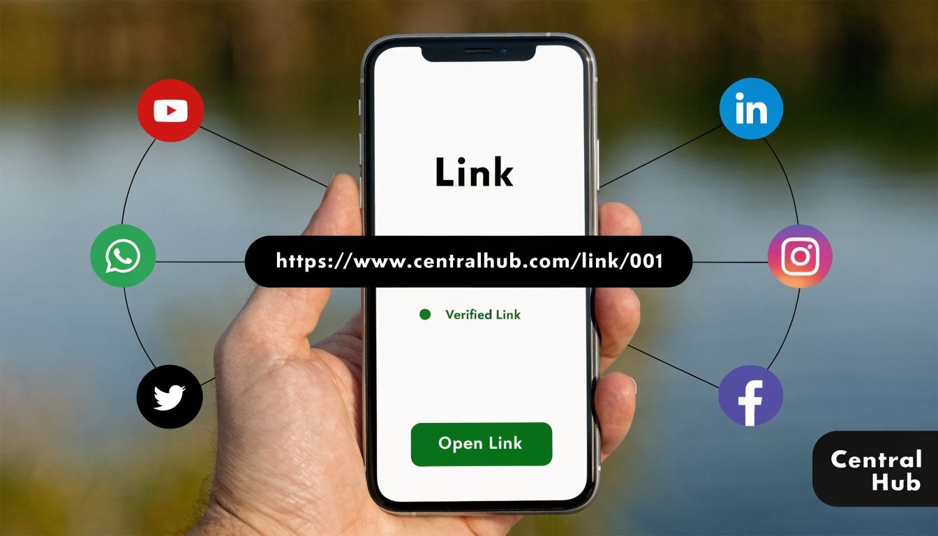
Honestly, this unified front instantly makes you look more professional and removes any friction for your audience to stay in the loop.
Pre-Launch Checks and Analytics
Before you blast your new link out to the world, it's smart to run through a quick pre-flight checklist. The last thing you want is a broken link or a clunky mobile view right after a big announcement.
- Test Your URL: Generate your custom short URL and give it a few clicks. This clean link is what you'll use in bios, email signatures, and QR codes, so make sure it points exactly where it should.
- Check on Mobile: Grab your phone—don't just use a simulator—and navigate your site. Does every block load correctly? Are the buttons easy to tap? A bad mobile experience is a surefire way to lose people.
Finally, take a moment to get acquainted with the built-in analytics dashboard. These numbers are your best friend from day one. You'll be able to see which links get the most attention, where your traffic is coming from, and what content truly resonates with your visitors.
Understanding your analytics isn't just about chasing numbers; it's about listening to what your audience is telling you. The data shows you exactly what they want, so you can fine-tune your page to better meet their needs and, ultimately, improve your conversion rates.
Once you’ve ticked these boxes, you're ready for takeoff. Share your new link across all your profiles and start consolidating your audience into one focused, high-value community. This is how you create a one page website that actually works for you.
Common Questions About One Page Websites
If you're thinking about building a one-page site, you probably have a few questions swirling around. That's smart. It's always best to get these answers upfront so you can move forward with a solid plan. Let's tackle the big ones I hear most often.
People always ask me if a single page can really do the job of a full-blown website. The honest answer? It completely depends on what you're trying to accomplish. If you have a single, focused goal—like promoting an event, selling one star product, or showing off your portfolio—a one-pager is often the better choice. It cuts out the noise and gets straight to the point.
But for a large company with different departments or an e-commerce store with a huge catalog, a traditional multi-page site is still the way to go.
How Does SEO Work on a Single Page?
The next big question is always about SEO. There's a common myth that a single page can't rank well on Google because it's just one URL. I'm here to tell you that's just not true. You can absolutely optimize when you create a one page website.
The trick is to think of each section of your page as its own mini-page. Give every section a clear, descriptive heading. Flesh out your "About" and services sections with plenty of relevant detail, and sprinkle your keywords in naturally. Things like embedding videos or adding customer testimonials are also huge signals to search engines that your page offers real value.
A single page packed with relevant, well-structured information is far more valuable to Google than a thin, multi-page site with sparse content. Think depth over breadth.
Structuring Content for Different Goals
So, how should you actually lay everything out? Your page's structure should be designed around your main call to action.
- Selling a Product: Hit them with a stunning hero image of the product right away. Follow that up with some persuasive copy, glowing customer reviews, and a big, impossible-to-miss "Buy Now" button.
- Booking Clients: Start by clearly stating the value you provide. Then, back it up by showcasing your best work in a portfolio or case studies, add some testimonials for social proof, and make it easy for them to reach you with a contact form or booking link.
- A Social Media Hub: Put your most important links right at the top. Underneath that, you can feature your latest content, like a new YouTube video or blog post, before listing your other social profiles.
When you tailor your site's structure to your primary goal, your one-page website becomes a powerful engine for guiding visitors exactly where you want them to go.
Ready to consolidate your online presence into one stunning page? With Bio Links Page Builder, you can design and launch your high-converting hub in minutes. Start building your free page today.
Drafted with the Outrank app
Pingback: How to Build an AI App: A Complete Step-by-Step Guide - One URL
Pingback: Get Free Link Juice: Proven Strategies to Boost SEO Authority - One URL
Pingback: Reddit Link Building Software: Optimize Backlinks and SEO Outreach - One URL
Pingback: What is Domain Hosting? A Guide for Australian Businesses - Website Builder Australia | Web Design & SEO Sunshine Coast QLD