From Theory to Practice: Deconstructing Ads That Work
Staring at a blank page for your advertising assignment? That's a familiar problem. You understand targeting, positioning, and creative strategy in theory, but turning those ideas into an ad someone would stop for is harder than it sounds.
That gap between classroom concepts and real execution is where most students get stuck. Good advertisement examples for students don't just look polished. They reveal why a format works, what audience need it speaks to, and how the creative choices guide attention.
This guide breaks down 8 modern digital ad formats as working playbooks, not a passive gallery. You'll see how brands use trust, utility, narrative, comparison, education, community, short-form video, and email to persuade different audiences. You'll also get adaptation ideas for class projects and a mini-assignment under each format so you can practice right away.
One useful pattern appears again and again in student marketing. The strongest campaigns usually connect with student priorities like affordability, convenience, and future career value, as shown in examples discussed by Branded Agency's student advertising roundup. If you keep those priorities in view, your ad concepts immediately become more relevant.
If you also want inspiration from a video-first angle, browse these top video ads for 2026.
Table of Contents
- 1. Social Proof & User Testimonials Format
- 2. Carousel/Swipeable Feature Showcase Format
- 3. Problem-Solution-Benefit Story Arc Format
- 4. Comparison/Before-After Visual Format
- 5. Educational/How-To Tutorial Format
- 6. User-Generated Content UGC & Community Spotlight Format
- 7. Platform-Native Short-Form Video Format TikTok/Reels/Shorts
- 8. Email Marketing Nurture Sequence Format
- 8 Student Advertisement Formats Compared
- Your Turn: Create Your First Standout Ad
1. Social Proof & User Testimonials Format
A testimonial ad answers one question faster than almost any other format. “Why should I believe you?” Instead of having the brand praise itself, the audience hears from a user, customer, creator, or student who has already tried the product.
This is why platforms like Notion, Canva, and Linktree often spotlight user outcomes, creator workflows, or customer stories. Even when the execution varies, the logic stays consistent. Real people reduce perceived risk.
Why this format works
Students are often skeptical of polished claims. They've seen too many ads that promise easy success. A testimonial format works better when it sounds like peer-to-peer guidance instead of corporate promotion.
For student audiences, the message becomes stronger when the speaker reflects real priorities. Affordability, convenience, and future career value tend to matter most in student-focused advertising, which is one reason brands like Adobe, Apple, and Chegg shape their student messaging around those needs, as noted in the earlier student advertising reference.
Practical rule: A testimonial should reveal a decision-making reason, not just satisfaction. “It helped me build my portfolio” is stronger than “I liked it.”
A weak testimonial says the product is “great.” A strong one says what problem it solved. For example, a design student might explain that Canva helped them present coursework more professionally. A creator might show how a bio link page made their profile easier to use.
Student project playbook
If you're building advertisement examples for students for a class brief, don't invent dramatic performance claims. Use believable details instead. Name the user, the context, and the specific task they completed.
Try this structure:
- Start with identity: “I'm a student photographer.”
- Name the friction: “My work was scattered across different platforms.”
- Show the shift: “Now people can find my portfolio and contact details in one place.”
That sequence feels authentic because it mirrors real decision-making. It also teaches you something important about ad writing. Credibility usually comes from clarity, not hype.
Mini-assignment: Interview one classmate about a tool they use for study, design, note-taking, or content creation. Turn their answers into a three-panel testimonial ad. Panel one introduces the person. Panel two shows the problem. Panel three shows the practical benefit.
2. Carousel/Swipeable Feature Showcase Format
Carousel ads are excellent teaching tools because they force disciplined sequencing. You can't dump every feature into one frame. You have to decide what deserves slide one, what supports it, and what should close the pitch.
That's exactly why this format appears so often on Instagram, Facebook, Pinterest, and creator-led brand pages. A good carousel doesn't just display features. It structures attention.
Why swipeable ads fit student attention
In a marketing-education context, PostNitro's discussion of advertisement examples for students notes that educational-value carousels and study-tip carousels work because they prove competence, solve a narrow problem, and are highly saveable and shareable. That's a useful lesson for student advertisers. Utility earns the swipe.
This matters even more in mobile-first environments. Students usually encounter ads while scrolling, not while sitting down to study a campaign. If the first slide doesn't make an immediate promise, the rest of the carousel won't matter.
Lead with usefulness. People swipe because they expect the next panel to help them, not because they admire your branding.
Think about a bio link page builder. The first card might say, “Put your portfolio, socials, and contact links in one page.” The next cards can show drag-and-drop blocks, video embeds, product sections, or theme customization. Each slide should add one clear reason to continue.
Student project playbook
The easiest mistake is overcrowding each card. Keep the copy short, the visual focal point obvious, and the sequence logical. One feature per frame works well because it teaches the viewer how to mentally organize the product.
For class use, follow this pattern:
- Slide one: The main promise
- Slide two: The most recognizable feature
- Slide three: A practical use case
- Slide four: A visual proof point
- Slide five: A clean call to action
A strong student example could promote a campus app, tutoring service, or portfolio site. The best versions feel almost like mini-lessons, not static posters.
Mini-assignment: Build a five-slide carousel for a fictional student product. Limit yourself to one sentence and one visual focus per slide. Then ask a classmate to describe the product after viewing it once. If they can't explain it clearly, your sequence needs revision.
3. Problem-Solution-Benefit Story Arc Format
Some ads persuade by proving. Others persuade by telling a story the audience recognizes. The problem-solution-benefit format works because it mirrors how people describe real frustration.
Dollar Shave Club used a version of this pattern in a memorable way. HubSpot often uses it in educational content. Mailchimp has used business-problem framing effectively as well. The details vary, but the structure is stable. Something is broken, something fixes it, and life gets easier after the fix.
A familiar structure from effective campaigns
For students, this format is especially useful because it forces you to think beyond decoration. You have to define the pain point first. If you can't articulate the problem, your solution will sound vague.
A good example for a student creator might begin with scattered links across Instagram, TikTok, and YouTube. The solution introduces one central page where followers can find everything. The benefit isn't just “more organized.” It's less friction for the audience and a more professional presence for the creator.
This connects with a broader truth in student-targeted advertising. Immediate utility often beats broad brand messaging. Students respond when the ad helps them act quickly and understand value fast.
Student project playbook
Use a simple three-scene script:
- Problem: Show confusion, clutter, or wasted effort.
- Solution: Introduce the product naturally, not like a sudden miracle.
- Benefit: Show what becomes easier, faster, or clearer.
Write the benefit in human terms. “Followers can find my work faster” is better than “centralized conversion architecture.” The second phrase sounds impressive but says very little.
Good ad stories don't begin with the brand. They begin with a recognizable inconvenience.
Mini-assignment: Choose a common student pain point such as managing deadlines, sharing notes, finding tutoring, or organizing creative work. Write a six-line script using the problem-solution-benefit structure. Then remove any line that sounds like a slogan instead of a real thought.
4. Comparison/Before-After Visual Format
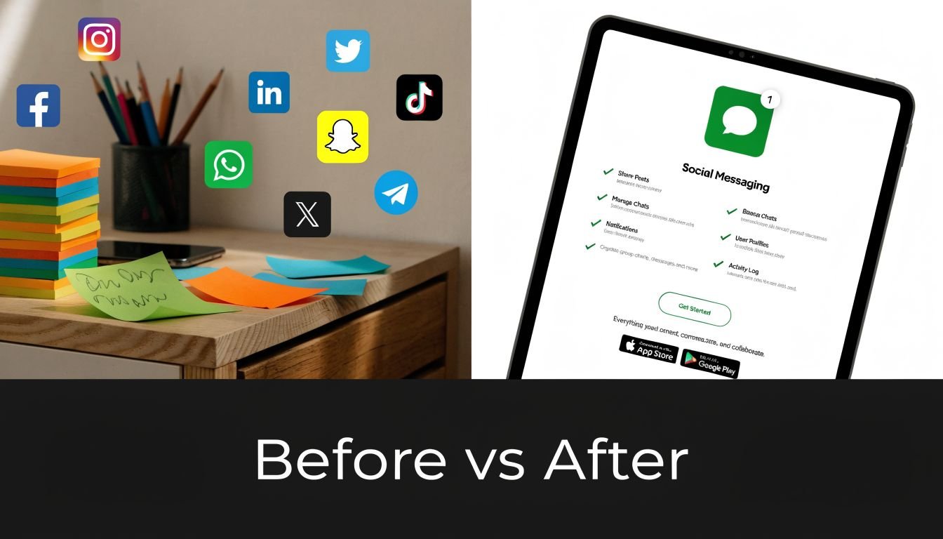
Comparison ads are blunt, and that's part of their power. They reduce persuasion to contrast. One side feels messy, slow, or confusing. The other side feels ordered, easy, and desirable.
That visual shorthand is why brands such as Slack, Asana, and Figma often rely on transformation framing. They don't need to explain every feature when the audience can instantly see the difference between disorder and clarity.
The transformation is the message
This format is especially useful for student projects because it teaches visual prioritization. You have to identify the one contrast that matters most. Is it speed versus delay? Clutter versus simplicity? Confusion versus control?
A before-and-after ad for a portfolio tool might show the “before” state as scattered profile links, inconsistent branding, and no clear call to action. The “after” state would present one clean page with sections for work samples, contact details, and social links.
The best versions don't rely on tiny labels. The viewer should understand the comparison almost instantly. That means layout, color, and hierarchy carry much of the argument.
Student project playbook
When you build one, keep the variables controlled. Use similar framing on both sides so the difference comes from the concept, not from random design changes.
Focus your comparison around one key shift:
- Messy to organized
- Hidden to discoverable
- Manual to efficient
- Generic to personalized
A campus-oriented example could compare a cluttered event promotion poster with a cleaner digital signup page. Another could compare a student's scattered freelance presence with a polished bio page.
Mini-assignment: Create a split-screen ad for a student service of your choice. Remove all body copy except “Before” and “After.” If the contrast still makes sense, your visual logic is strong.
5. Educational/How-To Tutorial Format
Educational advertising works best when the audience would value the lesson even if the brand disappeared from the frame. That's the discipline. If the content only exists to push the product, viewers sense it immediately.
HubSpot built much of its reputation by teaching before selling. Skillshare often lets course previews demonstrate platform value. Canva's tutorials regularly show people how to make something useful while naturally familiarizing them with the tool.
A tutorial example helps to watch in motion:
Teach first, sell second
This format performs well with students because learning and advertising overlap. A student doesn't mind branded content if it solves a real problem, especially one tied to coursework, content creation, or career development.
That aligns with a pattern seen in student-focused campaigns more broadly. Brands often gain traction by addressing practical concerns first, especially affordability, convenience, and future value. Educational ads make those concerns feel actionable rather than abstract.
For a bio link page builder, a tutorial could teach “how to organize your creator portfolio for internship applications” or “how to make your profile easier for collaborators to browse.” The product appears as the method, not the opening headline.
Student project playbook
Your tutorial ad should answer a narrow question. “How to market better” is too broad. “How to turn your social bio into a mini portfolio” is specific enough to teach well.
Use this flow:
- Hook with a problem: “Your best work is hard to find.”
- Teach a process: Show the steps without rushing.
- Introduce the tool naturally: Present it as the easiest way to complete one of the steps.
- End with a useful takeaway: Give the audience something they can apply immediately.
A tutorial ad earns attention by being useful before it becomes persuasive.
Mini-assignment: Record or script a short how-to ad for a student audience. Keep the topic narrow, such as organizing study resources, presenting freelance work, or sharing event details. After drafting it, highlight every sentence that teaches something. If most lines are promotional, rewrite.
6. User-Generated Content UGC & Community Spotlight Format
Some of the most convincing ads don't look like ads at all. They look like participation. A user posts a setup, a design, a workflow, or a creative result, and the brand amplifies it.
That's why UGC-driven brands often feel more alive than polished campaign-heavy brands. GoPro's reposted user footage, Airbnb's experience-centered visuals, and Etsy's seller spotlights all benefit from the same principle. The audience sees people using the product in their own style.
Why community content persuades differently
UGC works because it broadens what the product seems capable of. A brand can say, “Use this tool creatively.” A community can prove it in many different ways.
For students, this is a useful format to study because it teaches social context. You're not only advertising a product. You're advertising a culture of use. That matters for student audiences who often look sideways at peers before they look upward at brand claims.
A creator-focused bio link page campaign might feature a minimalist design from a writer, a colorful multimedia page from a musician, and a product-forward version from a student seller. Same platform, different identities.
Student project playbook
The key is curation. Don't just collect random submissions. Select examples that reveal different user goals and aesthetics.
A strong classroom version could include:
- A practical spotlight: A student freelancer showing portfolio links
- A campus organizer spotlight: An event page with schedules and signups
- A creator spotlight: A page that combines content, contact, and media
You also need clear crediting. Community spotlight ads feel respectful when the original user is named and visually centered.
Community-based ads work when the brand acts like a host, not the hero.
Mini-assignment: Find three examples of student-created content in any category, such as poster design, reels editing, portfolio pages, or club promotion. Build a mock “community spotlight” ad series that shows three distinct styles without flattening them into one brand voice.
7. Platform-Native Short-Form Video Format TikTok/Reels/Shorts
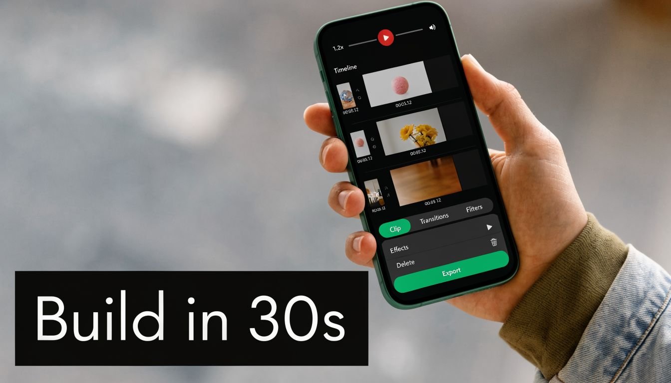
Short-form video has a brutal filter. If the opening second feels generic, the viewer leaves. That's why platform-native ads outperform polished-but-detached creative on TikTok, Instagram Reels, and YouTube Shorts. The ad has to feel like it belongs in the feed.
Creators and software brands have learned this well. Canva often demonstrates speed and simplicity in quick video cuts. Notion clips often anchor around one productivity improvement. Shopify-style small business clips tend to work when they show a relatable setup or a visible result quickly.
Native beats polished when the platform is fast
A good short-form ad usually opens with a hook, not a logo. The hook can be a frustration, a challenge, a direct promise, or an unexpected demonstration.
For student audiences, the most effective creative often uses relatable scenarios and visual storytelling to communicate value quickly, which is especially important in mobile-first environments, as noted in the earlier student advertising reference. That should shape how you script. Don't begin by explaining your campaign concept. Begin with the moment the audience recognizes themselves.
You might open with, “My portfolio was buried in five different apps,” then cut to a screen recording of one organized page. That's clearer than leading with brand introduction.
For more platform-specific tactics, this guide from ShortsNinja on TikTok marketing is worth reviewing.
Student project playbook
Use vertical framing, fast cuts, large captions, and one central action. Don't cram multiple messages into one clip. On short-form platforms, focus beats completeness.
A strong student short-form concept often includes:
- A direct hook: A problem or claim the viewer understands instantly
- A visible action: Building, fixing, organizing, or transforming something on screen
- A simple payoff: A cleaner setup, easier sharing, or stronger presentation
Mini-assignment: Draft a 20-second vertical video ad with six shots maximum. Write the on-screen text for each shot. Then read only the text without the visuals. If the story still tracks, your structure is solid.
8. Email Marketing Nurture Sequence Format
Email ads feel less glamorous than social ads, but they teach an important strategic lesson. Persuasion doesn't always happen in one exposure. Sometimes people need a sequence of reminders, examples, and clarifications before they act.
That's why onboarding flows from brands like Substack, Gumroad, ConvertKit, Shopify, and HubSpot are so useful to study. Each message moves the reader one step forward instead of trying to close everything at once.
Why email still matters in digital campaigns
For students, email is a great format to practice because it forces message discipline. You can't depend on motion graphics, trending audio, or swipe behavior. Your subject line, opening, and structure have to carry the weight.
A strong nurture sequence often starts with a familiar friction point, such as scattered links, weak personal branding, or confusion about where to send people. Later emails can introduce product features, use cases, or examples from similar users. The sequence works because relevance builds over time.
Email also pairs well with student audiences when the offer has obvious utility. If the message helps someone organize work, present projects, or simplify communication, it earns more patience than a purely image-driven pitch.
Student project playbook
Think of each email as one job, not a small brochure. One email welcomes. One clarifies the problem. One explains the solution. One demonstrates use.
Keep your sequence scannable:
- Subject line: Concrete and relevant
- Opening sentence: State the reader's problem quickly
- Body: One idea, short paragraphs
- Call to action: One next step, clearly phrased
You can adapt this for a campus club, student startup, tutoring service, or creator tool. The format is flexible because the psychology is simple. Repetition with variation builds confidence.
Mini-assignment: Write a three-email sequence for a fictional student product. Email one should identify the problem. Email two should show how the product fits into a routine. Email three should present a specific invitation to try it.
8 Student Advertisement Formats Compared
| Ad Format | Implementation Complexity 🔄 | Resource Requirements ⚡ | Expected Outcomes 📊 | Ideal Use Cases 💡 | Key Advantages ⭐ |
|---|---|---|---|---|---|
| Social Proof & User Testimonials Format | High, sourcing, consent, and production workflows | High, video production, editing, participant incentives | Strong, builds trust and demonstrates ROI | Mid-funnel conversion, demos for creators & SMBs | Credibility boost and reduced adoption friction ⭐ |
| Carousel / Swipeable Feature Showcase | Medium, design per slide and flow planning | Low–Medium, creative assets, mobile optimization | Good, improved feature comprehension and engagement | Mobile social ads, feature education, quick demos | Digestible, interactive, easy to A/B test ⭐ |
| Problem‑Solution‑Benefit Story Arc | Medium–High, requires storytelling and testing | Medium, scripting, longer-form production or copy | High, emotional engagement, improved recall & conversion | Brand building, long-form channels, agency pitches | Memorable narratives that drive action ⭐ |
| Comparison / Before‑After Visual Format | Low–Medium, strong design plus honest metrics | Low–Medium, mockups, authentic screenshots, design | Good, instant comprehension and conversion lift | Landing pages, quick ads, product transformation demos | Clear transformation display; fast persuasion ⭐ |
| Educational / How‑To Tutorial Format | Medium, requires subject expertise and structure | Medium, research, production, downloadable assets | High, authority building, SEO, long-term lead gen | Top‑of‑funnel, SEO-driven content, creator education | Builds trust and sustainable audience growth ⭐ |
| User‑Generated Content (UGC) & Community Spotlight | Medium, curation, permissioning, moderation | Low, repurposes existing user assets; community incentives | High, authenticity, organic reach, network effects | Community-driven brands, social proof campaigns | Most authentic and cost-effective at scale ⭐ |
| Platform‑Native Short‑Form Video (TikTok/Reels/Shorts) | Medium, trend-aware editing and rapid iteration | Low–Medium, short productions, frequent posting cadence | High, reach, virality, rapid discovery for creators | Awareness, creator acquisition, viral campaigns | Algorithmic reach and high virality potential ⭐ |
| Email Marketing Nurture Sequence | Medium, segmentation, sequencing, timing tests | Medium, automation tools, content series, list building | Very High, predictable conversions and strong ROI | Lead nurturing, onboarding, conversion-focused flows | Direct, measurable channel with best ROI ⭐ |
Your Turn: Create Your First Standout Ad
You now have eight strong formats to work from, and each one teaches a different persuasive skill. Testimonials teach credibility. Carousels teach sequencing. Story arcs teach audience empathy. Before-and-after visuals teach contrast. Tutorials teach value creation. UGC teaches community framing. Short-form video teaches speed and relevance. Email teaches patience and progression.
That's the lesson behind advertisement examples for students. You're not collecting templates. You're learning how ads translate human needs into creative decisions. A student worried about cost responds differently than a creator trying to organize links, and both respond differently than a small business owner trying to look more professional online.
Keep that audience-first mindset in front of every draft. Student-focused ads tend to succeed when they address priorities people care about, especially affordability, convenience, and future usefulness. That's why education discounts, study support tools, and portfolio-building offers show up so often in student campaigns. They don't just promote products. They connect the product to an immediate need.
When you practice, don't try to master all eight formats at once. Choose one and execute it well. If you're visually strong, start with a comparison ad or carousel. If you like writing, build a problem-solution-benefit script or a three-email sequence. If you're comfortable on camera, make a short-form video or tutorial. Depth beats imitation.
There's also a practical advantage to using one product across multiple formats while you learn. A bio link page is a good example because it gives you something concrete to advertise. You can show a before-and-after transformation, build a feature carousel, collect a testimonial, or create a tutorial around setup and customization. The product becomes your training ground for message testing.
If you want to simplify the creative side while experimenting, this piece on simplifying ad design with AI can help you think through production workflows.
The strongest student portfolio pieces usually show applied thinking, not just polished visuals. A professor, client, or hiring manager wants to see whether you understood the audience, selected the right format, and made clear strategic choices. That's what turns a class exercise into convincing work.
Choose one framework from this guide. Build one ad. Then improve it after feedback. That's how good advertisers develop.
If you want a practical way to apply these ideas, try Bio Links Page Builder. It gives you a simple product and landing experience to practice with: build a mobile-first bio page, organize links, add videos or product sections, and turn that page into the centerpiece of a testimonial ad, carousel, tutorial, or before-and-after campaign. It's free to use, easy to customize, and useful for creators, students, freelancers, and small teams who need one clear destination instead of scattered links.