
Your content probably looks better than your brand feels.
You've got a TikTok profile sending people to Instagram. Instagram sends them to a shop. Your newsletter lives somewhere else. Your offers have slightly different wording on every platform. Then someone taps your bio link and lands on a page that feels like a storage closet for links instead of a clear next step.
That's the moment a brand strategy template becomes useful. Not as a branding exercise for its own sake, but as the document that stops you from rewriting your identity every time you post, launch, or update your bio page. It gives you one source of truth for what you stand for, who you serve, how you sound, and what people should do next.
The part most guides miss is implementation. A strategy file sitting in Google Docs won't help much if your actual public touchpoint still feels random. Your bio link page is where the strategy gets tested. It's where your message, offer structure, visuals, and calls to action all meet in one small mobile-first space.
Table of Contents
- From Brand Chaos to Brand Clarity
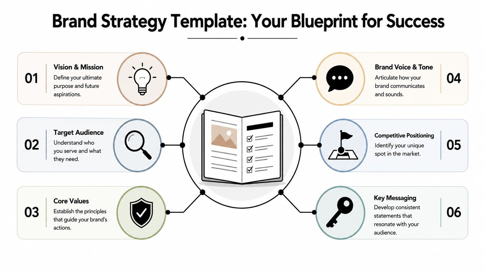
- What Is a Brand Strategy And Why It's Not Just a Logo
- Your Editable Brand Strategy Template Explained
- How Real Creators Apply Their Brand Strategy
- Common Pitfalls That Derail Your Brand Strategy
- Activate Your Strategy on Your OneURL Bio Page
From Brand Chaos to Brand Clarity
Most creators don't have a branding problem first. They have a consistency problem.
The content may be strong. The offer may be real. The audience may already care. But the experience feels disjointed because every platform tells a slightly different story. Your TikTok tone is playful, your Instagram bio sounds corporate, your product page sounds generic, and your bio link page lists everything with no obvious priority.
That confusion leaks into conversion. People don't just buy because they saw your link. They buy because they quickly understood who you are, what you help with, and what they should click first.
A useful brand strategy template fixes that by forcing a few decisions often postponed:
- Purpose: What do you want to be known for in one clean idea?
- Audience: Who are you trying to help, not just attract?
- Positioning: Why should someone choose you over another creator, shop, or freelancer?
- Behavior: How should your brand sound, look, and act in public?
Practical rule: If a new follower can't describe your brand in a short sentence after visiting your bio page, your strategy isn't clear enough yet.
This matters even more now because many templates still stop at static brand language and ignore how strategy needs to show up in modern creator touchpoints. A 2026 Canva resource citing Superside analysis notes that brands that distill their identity into a “one-word purpose” and combine it with visual elements like video galleries see 2.5x increase in discoverability, while 62% of brands are failing to adapt to AI-driven personalization and short-form video trends.
That gap shows up on bio pages every day. A creator says their brand is about “clarity,” but their link hub has eight competing calls to action. A maker says their work is premium, but their page design feels improvised. A consultant says they help founders move fast, but their page makes visitors hunt for the booking link.
Brand clarity isn't abstract. It changes what people tap, how long they stay, and whether your page feels trustworthy at first glance.
What Is a Brand Strategy And Why It's Not Just a Logo
A logo is one expression of a brand. It isn't the brand strategy.
The cleanest way to explain it is this. Brand strategy is the blueprint. Brand identity is the visible finish. One decides what the house is for and how it should function. The other chooses the paint, fixtures, and materials.

Strategy is the logic behind the look
If you skip strategy, design choices become decorative. You pick colors because they look nice. You write taglines that sound polished. You choose a profile photo style based on trend, not fit. Then your brand starts drifting because none of those decisions are anchored to a clear point of view.
A real brand strategy answers practical questions:
- Why do you exist beyond posting or selling
- Who is the brand built for
- What problem or aspiration do you organize around
- How should people describe the experience of interacting with you
- What should stay consistent across channels
That's why structured templates became more important as brand work matured into an operating discipline. Valesco's summary of Interbrand and AMA findings notes that in 2003, Interbrand's Brand Valuation report found that brand equity accounted for 54% of the market capitalization of S&P 500 companies, and a 2010 AMA study found that companies using formal brand templates had 23% higher return on marketing investment.
Those numbers matter because they shift branding from “nice to have” into “manage it on purpose.”
What a strategy decides before design starts
Before you pick fonts or build a link page, strategy should settle a few core choices.
| Decision area | What it actually controls | How it shows up on a bio page |
|---|---|---|
| Purpose | Your central promise | Headline and first impression |
| Audience | What visitors need first | Link order and featured blocks |
| Positioning | Why you're different | CTA wording and proof elements |
| Voice | How you sound | Bio copy, button labels, section names |
| Values | What you will and won't do | Offer framing and content boundaries |
A weak strategy leads to pages that are visually tidy but strategically noisy. They contain a little bit of everything, because nothing has been prioritized.
A good logo can make you recognizable. A good strategy makes you understandable.
When creators confuse identity with strategy, they often spend the most energy on the least consequential layer. They tweak page backgrounds, update profile images, and redesign icons while the larger questions stay unanswered. Who is this page for? What action matters most? What should feel different here than on anyone else's link page?
That's the work a brand strategy template is meant to hold.
Your Editable Brand Strategy Template Explained
A strong brand strategy template shouldn't read like homework. It should behave like a working brief you can return to before you publish a post, rename an offer, or rebuild your bio link page.
The best templates move in phases. Asana's brand strategy template guide describes a phased approach where formalizing the Discovery phase helps brands align faster, with a DesignBridge 2025 report showing 85% of brands that formalize discovery see 2x faster team alignment. The same source notes that 40% of strategies fail due to untested personas when teams skip data-driven validation.
Start with discovery, not decoration
Strategists often want to rush at this stage. Don't.
You need enough reality before you make identity decisions. Discovery means collecting what's already true about your brand, audience, and market.
Use prompts like these:
- Mission: What are you helping people do, solve, become, or avoid?
- Vision: If your brand succeeds over time, what changes for your audience?
- Values: Which principles shape how you create, sell, respond, and show up?
- Audience reality: Who already buys, replies, shares, or watches to the end?
- Pain points: What frustrates your audience before they find you?
A simple way to keep discovery useful is to separate observed facts from aspirational language. “My audience is ambitious but time-poor” is stronger than “My audience is everyone who values growth.” The first can guide message and page order. The second can't.
Good discovery inputs
- Comments and DMs: Repeated wording from real followers
- Sales or inquiry patterns: What people ask before buying
- Platform behavior: Which content themes pull response
- Competitor contrast: What your space says too often, and what it avoids
Build the strategic core
Once discovery is grounded, fill the middle of the template. Your brand becomes more decisive in this section.
Start with positioning. Write one sentence that says who you help, what outcome you focus on, and what makes your approach distinct. If your sentence could describe five other creators, it's still too generic.
Then define brand voice and tone. Voice is stable. Tone flexes by context. A creator might have a voice that is calm, sharp, and practical. Their tone on a sales page may be more direct than their tone in a community update, but it still sounds like the same person.
Use a short table to force clarity:
| Element | Weak version | Stronger version |
|---|---|---|
| Audience | Women who like wellness | Busy women rebuilding energy after burnout |
| Positioning | Helpful fitness coach | Strength coach for people who hate performative fitness culture |
| Voice | Friendly | Clear, firm, encouraging, no fluff |
| Message pillar | Mindset | Sustainable habits that fit real schedules |
Core messaging pillars come next. Limit them. If everything is a pillar, nothing is.
A practical template usually includes three to five pillars such as:
Primary transformation
What result people come to you for.Method or philosophy
How you approach that result differently.Proof or trust
What reassures people that your approach is credible.Lifestyle or worldview
The broader belief system that gives the brand texture.
Field note: Your page copy gets much easier to write when each link can be traced back to one clear messaging pillar.
Turn strategy into usable guidance
The final part of the template should help you implement, not just think.
Write visual identity guidelines in plain language. Don't just list hex codes and fonts. State what the visual system should communicate. For example: restrained, editorial, warm, premium, playful, grounded, fast-moving. Those words protect you from making random design decisions later.
Then add an application section. This is the part many templates miss. Include notes for:
- Bio headline
- Profile photo style
- Link naming conventions
- Offer descriptions
- Featured content blocks
- Proof elements such as testimonials, process photos, demos, or video
Also include a short list of what the brand is not. This helps as much as the positive definition does.
For example:
- Not preachy
- Not luxury-coded if affordability is core
- Not hyper-polished if authenticity is central
- Not trying to serve beginners and advanced buyers with the same page copy
A completed brand strategy template should let you answer these questions quickly:
- What should a first-time visitor understand in seconds?
- What click matters most right now?
- Which offers deserve priority?
- What tone should each button label use?
- Which content belongs on the page, and which should stay off?
If your template can't guide those choices, it's still too abstract.
How Real Creators Apply Their Brand Strategy
The difference between a decent template and a useful one is whether it changes visible decisions. That's easier to see with real-world creator patterns.
Alex the fitness coach
Before strategy, Alex's pages all sounded different. His Reels were intense and motivating. His bio sounded generic. His link page mixed meal plans, old YouTube videos, a supplement code, and a booking link with no hierarchy.
After filling out a brand strategy template, one thing became obvious. His voice was tough, direct, and supportive, and his audience didn't want endless inspiration. They wanted structure and accountability.
That changed his page choices fast. He shortened his headline, renamed links in his natural voice, and moved his core offer to the top. “Programs” became “Start Your Training Plan.” A vague newsletter link became “Weekly No-Excuses Check-In.” His page started sounding like the same coach people saw on video.
Maria the artisan seller
Maria sells handmade home goods. Her products were beautiful, but her online presence looked split between craft fair warmth and polished e-commerce language.
Her strategy clarified that the brand wasn't just about products. It was about slow craftsmanship, material honesty, and thoughtful gifting. Once that was written down, the page changed from a list of shop links into a narrative. She led with her current collection, added a gallery block showing process shots, and linked to a journal post about sourcing and care.
That shift matters because people buying handmade goods often want context, not just transaction. The strategy gave her permission to make process part of the sale.
A quick example helps if you want to see how creators think through this in practice.
Dev the SaaS freelancer
Dev helps early-stage software teams with positioning and launch messaging. His old page tried to prove too much. It had a long bio, several service types, and links that assumed visitors would patiently explore.
His strategy sharpened the offer around clarity and speed for startup teams that need momentum. Once that was clear, he stripped the page back. Fewer links. Cleaner labels. More direct calls to action.
His top section focused on one promise and one next step. Lower on the page, he added only the proof that matched buyer anxiety: portfolio, testimonials, and a short explainer on his process. No extra clutter. No vague personal-brand filler.
Good strategy doesn't make every page look the same. It makes each page feel internally coherent.
These examples look different on purpose. Alex needs energy and commitment. Maria needs texture and trust. Dev needs speed and signal. The strategy gives each of them a filter, so the final page reflects the brand instead of just storing links.
Common Pitfalls That Derail Your Brand Strategy
A brand strategy template can still fail if you fill it with guesses, flattering language, or ideas you never apply.
The strongest warning sign is false confidence. The document feels complete, but your public brand still sounds vague, looks inconsistent, or asks visitors to do too many things at once. That usually means the strategy wasn't wrong in theory. It was wrong in execution.
ReferralHero's summary of Adobe and Wix benchmark data notes that brands using a phased template approach see 28% higher customer retention. It also reports that 52% of small businesses fail at audience analysis because of incomplete segmentation, leading to 18% lower conversions, while 37% overlook authenticity in brand behaviors, causing erosion of trust.
When the audience profile is fiction
Symptom. Your messaging sounds polished, but engagement is flat and your page copy could apply to almost anyone.
Diagnosis. You built a persona around the audience you want to attract, not the one interacting with you now. The profile becomes broad, flattering, and strategically useless.
Fix it by grounding the persona in behavior:
- Use real language: Pull phrases from comments, inquiries, and objections.
- Separate segments: A first-time buyer and a repeat customer often need different link priorities.
- State the pain clearly: “Needs help choosing a first offer” beats “wants business growth.”
When your brand tries to please everyone
Symptom. Your bio page has links for buyers, browsers, collaborators, fans, newsletter readers, sponsors, and casual followers, all competing for attention.
Diagnosis. You haven't chosen a primary job for the page. Without a strategic priority, every opportunity gets equal visual weight.
A simple decision filter helps:
| If this is your current goal | Prioritize this on-page | Deprioritize this |
|---|---|---|
| Sell a product | Shop, product proof, FAQs | Older content archives |
| Book clients | Service CTA, testimonials, process | Casual social links first |
| Grow community | Newsletter, best content, about | Secondary offers |
When the document never becomes behavior
Symptom. The brand strategy exists in a doc, but your captions, buttons, visuals, and offers still feel improvised.
Diagnosis. The template stayed conceptual. Nobody translated it into operational rules.
Fix that by creating small, visible constraints:
- Voice guardrails: List words you do use and words you avoid.
- CTA rules: Keep button language consistent with your tone.
- Visual boundaries: Define what imagery feels on-brand and what doesn't.
- Monthly audit: Check whether the top of the page still reflects your current priority.
If your strategy can't tell you what to remove from a bio page, it isn't specific enough yet.
The final trap is treating consistency like repetition. Consistency doesn't mean every platform says the exact same thing. It means the same logic holds across different contexts. Your short video, product page, and bio link page can all look different while still expressing one recognizable brand.
Activate Your Strategy on Your OneURL Bio Page
The brand strategy template stops being a document and starts becoming a conversion tool at this stage.
Your bio page is a compressed brand environment. Visitors make fast judgments there. They decide whether you're credible, relevant, and worth another tap. That's why cohesion matters. A Visme summary of Forrester, Shopify, and related data reports that a 2024 Forrester study of 1,200 firms found templated brand frameworks led to a 35% increase in customer engagement and a 19% uplift in conversion rates. The same source notes a Shopify analysis found stores with documented brand strategies had 27% higher repeat purchase rates.
![]()
Map each strategy element to a page decision
Don't treat your OneURL like a neutral container. Build it as an expression of your strategy.
Here's the practical mapping:
Mission becomes your headline.
Not a slogan for its own sake. A plain statement of who you help or what you make possible.Audience persona shapes block order.
If visitors usually need proof before buying, show proof early. If they need a fast path to book, place the service CTA first.Brand voice writes your button labels.
A calm expert might say “Book a Consultation.” A more energetic coach might say “Start Here.”Messaging pillars become categories of links.
Education, offer, proof, story, and community can each become a visible section.Visual identity decides theme, spacing, imagery, and overall density.
A minimalist consultant page shouldn't look like a playful merch drop, and vice versa.Positioning decides what gets omitted.
If your edge is simplicity, your page can't feel crowded.
A simple order for a high-converting page
Most creator pages improve when they follow a clear sequence instead of stacking links randomly.
Immediate orientation
Headline, short descriptor, and one clear promise.Primary action
The click that matters most right now. Shop, book, subscribe, watch, inquire.Proof block
Testimonials, featured work, media, product visuals, or embedded content.Secondary paths
Useful but lower-priority destinations such as blog posts, playlists, or archives.Social continuity
Platform links for people who want a broader relationship with the brand.
This order won't fit every business, but the principle holds. Lead with the action tied to your current strategic goal, not the action you hope visitors will figure out on their own.
What good implementation looks like
A strong OneURL page does three things at once. It reflects your identity, reduces decision fatigue, and makes the next step easy.
That means using the strategy document as an editing tool, not just a writing tool. Before publishing, ask:
- Does the page headline match the actual brand promise?
- Do link titles sound like the same brand voice?
- Is the first CTA aligned with the audience's immediate need?
- Are visuals reinforcing the positioning or distracting from it?
- Is there anything on the page that belongs to an older version of the brand?
The best bio pages feel obvious to the visitor because the creator already made the hard decisions upstream.
That's the primary advantage of a brand strategy template. It shortens future decisions. You don't have to reinvent the wording of every link, every launch, every featured block, or every offer description. You just apply the logic you already chose.
If your links are scattered and your messaging keeps changing from platform to platform, build one clear home for your brand with Bio Links Page Builder. It gives you a fast way to turn your strategy into a mobile-first OneURL with drag-and-drop blocks, multimedia sections, product showcases, social integrations, and clean page customization, so your audience gets one focused path instead of a pile of disconnected links.