
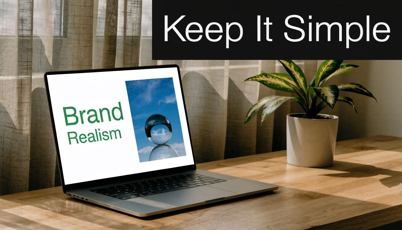
You open a tri-fold template, a blank landing page, or a bio link page stuffed with buttons, and the same question shows up fast. Can a visitor understand the offer, trust it, and act on it within a few seconds? That is the brochure design job now.
Brochure design ideas no longer sit neatly inside print categories. In practice, the modern brochure is often a single-page digital asset: a service overview, a media kit, a product launch page, or a bio link page built with the discipline of a focused microsite. The format has changed. The core function has not. It still needs to direct attention, structure information, and support one clear conversion path.
This shift is significant, as demand for brochure design services continues to grow. The global brochure design service market was valued at about USD 2.5 billion in 2023 and is projected to reach USD 5.8 billion by 2033, according to DataHorizzon Research's brochure design service market analysis. This indicates that businesses still need structured, persuasive marketing assets. They increasingly need them in digital form.
The best digital brochures still rely on the same fundamentals that made print brochures work: clear hierarchy, tight messaging, disciplined spacing, and a deliberate call to action.
What changes online is the execution. A strong one-page brochure also has to handle mobile reading, scrolling behavior, tap targets, load speed, and light interaction without turning into a full website that asks for too much attention. That trade-off matters. Too little structure and the page feels disposable. Too much complexity and the brochure loses the speed and clarity that make the format useful in the first place.
Table of Contents
- 1. Minimalist Single-Page Layout
- 2. Card-Based Grid Design
- 3. Hero Image with Gradient Overlay
- 4. Neumorphism Soft UI Design
- 5. Split-Screen Comparison Layout
- 6. Storytelling Timeline Design
- 7. Interactive Hover States and Micro-interactions
- 8. Social Proof and Trust Indicator Design
- 8-Style Brochure Design Comparison
- From Idea to Impact Your Next Steps
1. Minimalist Single-Page Layout
A prospect taps your link from Instagram, LinkedIn, or an email signature. On that first screen, they decide whether your brand feels clear, current, and credible. That is why a minimalist single-page layout works so well for modern brochure design. It brings the logic of a strong cover page into a digital format that has to perform fast on mobile.
Brands like Apple, Stripe, Notion, and Airbnb use restraint with purpose. They choose one message, one visual priority, and one next step. That discipline matters even more on a digital brochure or bio link page, where attention is short and every extra element competes with the action you want.
What works in practice
Minimalism isn't empty space for its own sake. It's editing. If your opening screen includes a clear brand mark, one strong image or visual anchor, and a short line that tells visitors what you do, you are already applying a sound brochure principle. PrintPlace's guide to key brochure design elements points to an uncluttered cover built around a standout image, the company logo, and a short phrase placed prominently near the top.
That same principle works on a one-page site, but the digital version has a stricter job. The first screen should answer three questions quickly: who you are, what you offer, and what the visitor should do next.
Practical rule: If a section presents two primary actions, neither one feels primary.
The trade-off is straightforward. A minimal page feels easier to scan and usually looks more premium. It also leaves less room to explain yourself. If your offer is unfamiliar, high-ticket, or regulated, you may need stronger supporting copy lower on the page. Keep the first screen clean, then add proof and detail where visitors expect it.
A few design choices consistently hold up:
- Use one dominant headline: Skip the pileup of slogan, promo tag, announcement bar, and badge above the fold.
- Build space around priority content: Padding improves readability and gives the page a calmer visual rhythm.
- Limit typography: Two font families are enough for nearly every brochure-style page. Three is usually the point where control starts slipping.
- Make the CTA unmistakable: The button should contrast clearly, read like an action, and feel easy to tap on a phone.
Minimalism breaks down when teams remove context along with clutter. A sparse page without specifics, proof, or directional cues does not feel refined. It feels incomplete. The best single-page brochures stay light, but they still do the selling.
2. Card-Based Grid Design
If you sell more than one thing, card layouts solve a real problem. They break complexity into choices. Shopify's app marketplace, Behance portfolios, Medium publication pages, and Pinterest-style interfaces all rely on cards because they make scanning easy.
This is one of the most practical brochure design ideas for creators, agencies, and online shops. A single-page brochure doesn't need to become a long essay. It can become a structured menu.
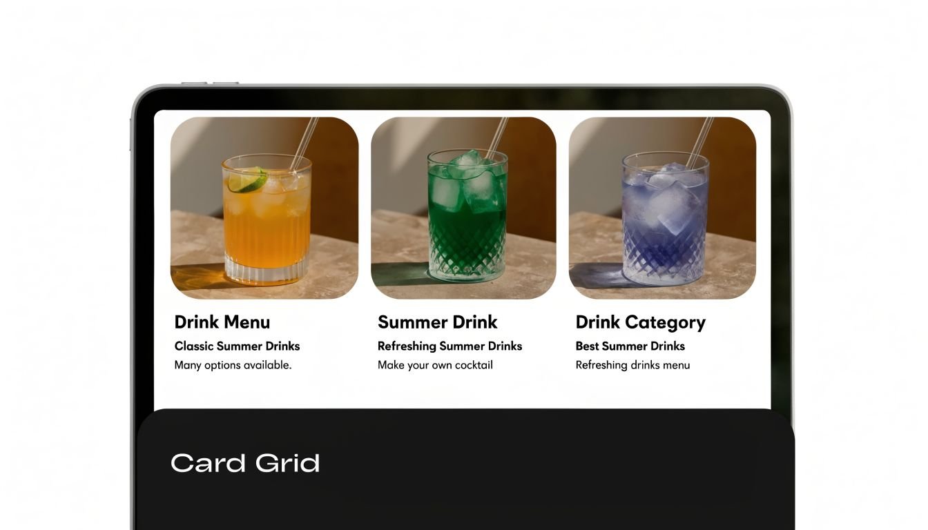
Where grids win and where they fail
Cards work best when each option can stand on its own. Service packages, featured products, lead magnets, article categories, booking paths, and social destinations all fit naturally into this format. On a bio link page, each card can act like a mini landing page, especially if the title, visual, and CTA are tightly aligned.
The mistake is using too many of them. Once everything becomes a card, nothing feels prioritized. I'd rather see four strong cards than ten weak ones.
A good card answers one question quickly. What is this, why should I care, and where does it take me?
Keep the mechanics tight:
- Hold the grid together: Consistent card dimensions make the page feel intentional.
- Reduce options on mobile: A single column usually beats a cramped two-column mobile layout.
- Use visual grouping: Space related cards together so users don't have to infer structure.
- Add restrained interaction: A hover lift, border shift, or shadow cue is enough.
Card grids are especially useful when your brochure acts as a hub. A maker can feature shop categories. A consultant can separate audits, retainers, workshops, and case studies. A creator can divide tutorials, sponsors, products, and newsletter links without turning the page into a wall of buttons.
3. Hero Image with Gradient Overlay
A visitor taps your bio link, lands on the page, and decides within a few seconds whether to keep scrolling or leave. That first screen has to do the work a printed brochure cover once did. In a digital brochure or one-page site, the hero sets the promise, tone, and next action at a glance.
A strong image helps, but only if it supports the offer. I see teams get this backward all the time. They pick a dramatic photo, then try to force a headline on top of it. Start with the message. Choose the image second.
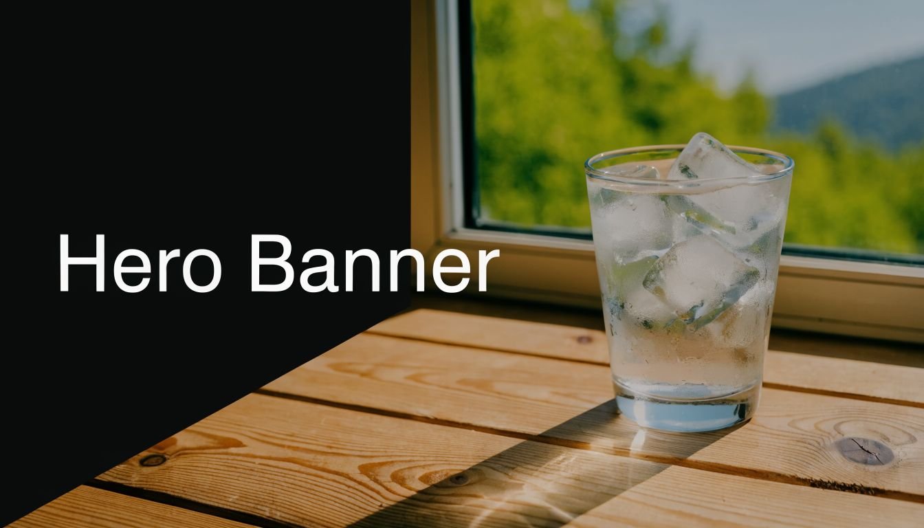
Make the first screen readable
Gradient overlays solve a practical problem. They reduce background noise, create enough contrast for type, and let the page feel polished without dropping text into a heavy box. That matters even more on modern brochure formats like launch pages, personal brand sites, and bio link hubs, where one screen often has to carry the whole pitch.
The best version is simple. One relevant image. One overlay that guides the eye. One headline that says what the offer is. One action that tells people what to do next.
That restraint is hard.
A cinematic hero can create instant interest, but it can also waste prime space if the copy is vague or self-focused. “Welcome to my world” asks the visitor to do interpretive work. “Book a brand shoot” or “Compare payroll plans” gives them direction immediately.
Use a hero overlay with discipline:
- Write the headline before choosing the photo: If the image and message compete, the message should win.
- Control contrast intentionally: Dark-to-transparent or color-tinted overlays usually read better than a uniform wash across the whole image.
- Place the CTA inside the visual path: Users often follow the subject's face, hands, or line of sight before they click.
- Check the mobile crop early: A desktop-perfect hero often fails once the focal point gets cut off on phones.
- Use images tied to the offer: Product shots, people, spaces, or results usually outperform decorative scenery.
One more trade-off matters here. Heavy overlays improve readability, but they can flatten the image and make the page feel generic. Light overlays preserve atmosphere, but weak contrast hurts response. The right setting depends on the job. If the page needs immediate action, favor clarity. If the goal is brand impression first, you can keep more of the image intact.
If you want drama, make it serve the message.
4. Neumorphism Soft UI Design
Neumorphism can make a page feel polished and premium. Soft shadows, raised surfaces, and inset controls create a calm interface that feels more tactile than flat design. You'll see versions of it in design showcases, premium SaaS dashboards, and some portfolio sites that want a distinct visual voice.
It works best when the brand already leans modern, minimal, and aesthetic-forward. It works worst when users need zero ambiguity, such as healthcare, legal intake, urgent service requests, or anything that depends on immediate button recognition.
Use softness selectively
The biggest issue with neumorphism isn't taste. It's affordance. A soft panel can look elegant and still fail to signal whether it's clickable, disabled, or decorative. If users have to guess, the effect is costing you conversions.
That doesn't mean you should avoid it entirely. It means you should confine it to areas where subtlety helps instead of hurts. Think profile cards, featured service blocks, plan selectors, or dashboard-style highlights inside a larger brochure page.
Soft UI needs hard decisions about contrast, type hierarchy, and interaction states.
A few boundaries keep this style usable:
- Keep the palette narrow: Too many colors break the illusion and make shadows muddy.
- Strengthen active states: Hover, pressed, and selected versions need to be unmistakable.
- Anchor with typography: Clear headings and body contrast prevent the interface from turning hazy.
- Use it for mood, not everything: A full page of soft-edged controls can become visually mushy.
One more caution. This style photographs better than it performs if you don't test it in real conditions. Bright daylight, low-end screens, and mobile glare will expose weak contrast immediately.
5. Split-Screen Comparison Layout
A visitor lands on your page and needs to answer one question fast: Which option fits me? A split-screen layout helps by putting the comparison at the top of the page, where the decision happens.
This format works especially well in modern digital brochures and one-page sites because it replaces long scrolling with immediate contrast. One side frames the tension. The other side resolves it. That structure is useful for problem versus solution, audience A versus audience B, product versus result, or personal brand versus offer.
The trade-off is clarity versus balance. If one panel carries all the meaning and the other exists to fill space, the layout feels staged. I see this most often when half the screen is given to a stock photo while the core message is squeezed into a narrow text column.
The stronger approach gives each side a distinct role. A consultant can put client pain points on the left and the engagement model on the right. A SaaS company can show the old workflow beside the improved one. A creator can pair a short positioning statement with a clear signup or booking action.
As noted earlier, brochure design has expanded far beyond the old trifold mindset. In digital work, that shift shows up through composition. Split layouts use division, contrast, and alignment to guide scanning without making the page feel crowded.
Use this pattern when comparison helps the buyer decide. Skip it when the message is linear and needs one clear reading path.
- Balance visual weight: Match the density of each side so one panel does not overpower the other.
- Write paired content: Headlines, icons, and supporting points should correspond across the split.
- Choose mobile order carefully: On smaller screens, stack the side with context before the side with the action, unless the conversion goal needs the reverse.
- Use contrast with purpose: Color, imagery, and spacing should explain the relationship between the two halves, not decorate it.
- Keep actions focused: One strong CTA per side is usually enough. More than that turns comparison into clutter.
6. Storytelling Timeline Design
A visitor lands on your brochure page, scrolls for ten seconds, and still cannot tell what happened first, what changed, or why your offer matters. A timeline fixes that by giving the page a reading order. For founder stories, service explainers, portfolios, roadmaps, and case-study style one-page brochures, sequence often does more persuasive work than another block of marketing copy.
This format fits the shift from print brochures to digital, single-page experiences. A printed trifold has panels to create order. A bio link page or scrolling brochure site needs to create that order through structure, pacing, and visual cues.
Turn sequence into credibility
Strong timeline design shows cause and effect. It answers practical questions fast. What problem showed up first? What did you do next? What result came from that step?
That makes timelines especially useful for service businesses and consultants. Instead of dropping visitors into disconnected sections like About, Process, Results, and Contact, you can connect those pieces into one story arc. The page becomes easier to scan, and the offer becomes easier to trust.
Selectivity matters. Five milestones with a clear shift in meaning will outperform a long chain of minor updates. If every point carries the same visual weight, the story loses momentum and the reader stops tracking progress.
A cloud-based workflow also makes this pattern easier to maintain than it used to be. According to Wise Guy Reports coverage of the brochure design software market, tools such as Canva and Lucidpress are part of a broader move toward collaborative, cloud-based brochure production. That matters for timeline pages because they often need regular edits, stakeholder input, and swapped visuals as the story evolves.
Use a timeline when sequence builds confidence:
- Start with a trigger: Show the initial problem, request, or opportunity that sets the story in motion.
- Keep milestones tight: Each step should be skimmable in a few seconds.
- Make progression visible: Use consistent dates, step labels, icons, or connectors so readers can follow the path without effort.
- Attach proof to key stages: Screenshots, deliverables, before-and-after visuals, or short result notes make the narrative concrete.
- Control emphasis: Give bigger moments more space, stronger imagery, or clearer headings so the page has rhythm.
The trade-off is length. Timelines can become slow if each milestone tries to do the job of a full case study. Cut aggressively, keep only the turning points, and let the sequence carry the message.
7. Interactive Hover States and Micro-interactions
Micro-interactions are tiny, but they shape whether a brochure page feels alive or clumsy. Stripe, Framer, Vercel, Figma, and Notion all use movement as feedback. Buttons respond. Cards shift. Toggles confirm. Loading states reassure.
That's the difference between animation and interaction. Animation is visual motion. Interaction is communication.
A quick example helps. If a service card lifts slightly on hover and the button tint changes, the user gets a fast signal that the element is active. If everything on the page slides, fades, rotates, and bounces, the user gets noise.
Here's a motion reference worth studying:
Motion should clarify, not decorate
Purposeful micro-interactions make one-page brochures easier to use. A hover state on a pricing option reinforces clickability. A button press state confirms action. A subtle scroll reveal can stage information so the page doesn't feel dumped onto the screen at once.
The trade-off is performance and restraint. Heavy motion often looks impressive in a design file and irritating on a real phone. It can also distract from your CTA, which defeats the point of a brochure.
Motion should answer a user's question. “Can I click this?” “Did that load?” “Where should I look next?”
A few rules keep motion useful:
- Respect reduced motion settings: Some visitors actively avoid animation.
- Keep timing consistent: Random motion speeds make a page feel cheap.
- Use simple transitions first: Opacity, scale, and position shifts are usually enough.
- Test older devices: Smooth on your laptop doesn't mean smooth for everyone.
If your motion doesn't improve clarity, cut it.
8. Social Proof and Trust Indicator Design
A visitor lands on your one-page brochure, likes the headline, scrolls to the CTA, then pauses. The offer may be clear, but the page still has to answer one silent question: why should I trust this?
That is the job of social proof.
On a modern brochure page, trust indicators do more than decorate the layout. They reduce friction at decision points. A short testimonial beside a booking button, a row of recognizable client logos under the hero, or a certification near a contact form can do more work than another paragraph of brand copy.
Specificity decides whether proof helps or hurts. “Great service” says almost nothing. A stronger testimonial names the problem, the type of client, and the outcome. Real names, job titles, company names, star ratings, press mentions, or platform badges add weight when you have permission to use them.
Digital brochure design changes the format, not the principle. What used to sit on the back panel of a printed brochure now needs to appear exactly where hesitation happens on a single-page site, link-in-bio page, or mobile landing page. Placement matters as much as the quote itself.
Use social proof with discipline:
- Place proof near decisions: Put testimonials, ratings, or logos close to CTAs, pricing, forms, and service summaries.
- Match the proof to the offer: A product review supports a purchase. A client testimonial supports a consultation or proposal request.
- Show context: Industry, company size, use case, or role helps the right visitor recognize themselves.
- Keep it current: Recent proof signals an active business. Old logos and outdated quotes can weaken confidence.
- Avoid overcrowding: Five strong signals usually outperform a wall of badges that no one reads.
There is a trade-off here. Too little proof makes the page feel risky. Too much makes it feel defensive or cluttered. The best brochure pages treat trust indicators as part of the conversion path, not as a scrapbook of every compliment the brand has ever received.
Trust should be easy to spot and easy to verify. That is what moves a digital brochure from attractive to convincing.
8-Style Brochure Design Comparison
| Design Pattern | Implementation Complexity 🔄 | Resource Requirements ⚡ | Expected Outcomes 📊 | Ideal Use Cases 💡 | Key Advantages ⭐ |
|---|---|---|---|---|---|
| Minimalist Single-Page Layout | Low–Medium: simple structure but needs careful content curation | Low: minimal assets, focused copy, high-quality imagery preferred | 📊 High conversion potential, fast load, lower bounce rates | 💡 Bio links, simple landing pages, professional portfolios | ⭐ Clear focus, mobile-optimized, easy maintenance |
| Card-Based Grid Design | Medium: modular grid and responsive rules required | Medium: multiple images/icons and consistent card content | 📊 Good for exploration and discovery; supports multiple CTAs | 💡 Product catalogs, multi-offering pages, portfolios | ⭐ Scannable organization, multimedia-friendly |
| Hero Image with Gradient Overlay | Low–Medium: straightforward but requires optimization/accessibility work | High: premium images/videos and optimization for performance | 📊 Strong first impression and brand recognition; variable direct conversions | 💡 Personal brands, influencers, storytelling homepages | ⭐ High visual impact, emotionally engaging |
| Neumorphism (Soft UI Design) | Medium–High: nuanced shadows and careful contrast tuning | Medium: refined styling, color testing, cross-device checks | 📊 Premium aesthetic and brand differentiation; risk if contrast poor | 💡 SaaS dashboards, premium portfolios, design-forward brands | ⭐ Unique, modern look with perceived quality |
| Split-Screen Comparison Layout | Medium: balanced layout and responsive stacking logic | Medium: two-sided imagery/content and alignment work | 📊 Excellent for comparisons and persuasive narratives | 💡 Feature vs. benefit pages, pricing comparisons, before/after showcases | ⭐ Balanced visual hierarchy, clear contrasts |
| Storytelling Timeline Design | Medium–High: chronological structure and responsive alternation | Medium: multiple content nodes, icons/images per milestone | 📊 Deep engagement and narrative clarity; longer sessions | 💡 Case studies, portfolios, company histories | ⭐ Memorable progression, strong storytelling |
| Interactive Hover States & Micro-interactions | High: animation design, performance and accessibility tuning | Medium–High: front-end dev, testing on varied devices | 📊 Increased engagement and perceived polish; possible perf trade-offs | 💡 Product demos, premium sites, interactive portfolios | ⭐ Clear feedback, guides attention, feels polished |
| Social Proof & Trust Indicator Design | Low–Medium: layout plus data/content management | Medium: collection of testimonials, ratings, integrations | 📊 Strong conversion uplift and trust building | 💡 E‑commerce, SaaS, service providers, product pages | ⭐ Credibility boost, reduces perceived risk |
From Idea to Impact Your Next Steps
A visitor lands on your page from Instagram, email, or a QR code on packaging. You have a few seconds to answer three questions: what you offer, why it matters, and what to do next. That sequence shapes the page more than any visual trend.
Brochure design works better now when you treat it as a single-page decision path across screens, not a static print piece uploaded to the web. The old tri-fold logic still helps. Clear hierarchy, disciplined spacing, and tight copy still do the heavy lifting. The difference is format. Today, that same discipline has to work inside link-in-bio pages, campaign microsites, service pages, and mobile-first one-pagers.
Use the eight ideas in this article as layout tools, not a checklist. Minimalist sections help when the offer is simple and trust is already high. Card grids work better when people need to compare options quickly. Hero visuals set tone fast, but they can also bury the CTA if they take over the first screen. Timelines add context, though they only earn their place when the story changes the buying decision.
Good brochure pages are selective.
A creator page might need a strong hero, a short card grid, and proof that the audience already pays attention. A consultant usually gets better results from a clear value proposition, one or two trust markers, and a direct contact action. A local service business often needs less design variety and more clarity: services, service area, reviews, and one obvious booking step.
Start small and build in order. Write the headline first. Choose one primary action. Pick the layout pattern that supports that action. Then test the page on a phone before adding more sections. If a block looks attractive but does not help someone decide, cut it.
That trade-off matters. More sections can make a brochure page feel richer, but they also increase scroll depth, content debt, and decision fatigue. In practice, shorter pages with a clear offer often beat longer pages packed with equal-weight messages.
If your current brochure lives as a PDF with low engagement, or your bio link page has become a stack of disconnected links, rebuild it around intent. Give each section a job. Let the page guide attention. Modern brochures succeed because they make the next step obvious.
If you want to turn these brochure design ideas into a live page quickly, Bio Links Page Builder is a practical place to start. You can build a focused, mobile-first one-page brochure with drag-and-drop blocks for links, videos, products, galleries, service listings, and contact options, then reorder sections until the story and CTA feel right. It's a clean fit for creators, small businesses, freelancers, and agencies that need a modern brochure page without touching code.