
You send a text that should feel exciting. A launch announcement, a booking reminder, a thank-you note, a last-call promo. Then it lands as a flat little block of words with all the energy squeezed out of it.
That's why animated text messages matter now. They add motion, timing, and personality without forcing people to leave their inbox. For creators, small brands, and service businesses, that makes them one of the easiest ways to look sharper on a screen people already check constantly.
Most guides stop at “tap this effect” and call it a day. That misses the better play. If you create animated assets once, you can use them in texts, repost them in stories, attach them to campaigns, and place them on your bio link page so the work keeps doing its job after the message is gone.
Table of Contents
- Beyond Emojis Why Animated Texts Are Your Next Upgrade
- Create Animations Instantly on Your Phone
- Level Up With Dedicated Animation Apps and Tools
- Drive Engagement with Animated Marketing Messages
- Add Animated Text to Your Bio Link Page
- Best Practices for Accessibility and Performance
Beyond Emojis Why Animated Texts Are Your Next Upgrade
Plain text still works for logistics. It's weak at tone. The same sentence can read playful, rushed, passive-aggressive, or dull depending on the moment and the recipient.
That gap is exactly why people moved beyond words alone. A Nielsen Harris Poll summary in Marketing Dive found that 71% of smartphone users incorporate emojis, stickers, or GIFs into their messages, and two-thirds of people ages 18 to 44 said GIFs express emotions better than words alone. That tracks with what creators already know in practice. Motion communicates mood faster than explanation.
Why motion changes the feel of a message
Animation does two useful things at once. It catches the eye, and it tells the viewer how to read the line. A bouncing “New drop live” feels different from static text. A subtle pulse on “Your order is ready” feels more polished than a wall of caps or extra punctuation.
Used well, animated text messages help with:
- Emotion: celebration, urgency, gratitude, reassurance
- Brand voice: playful, premium, bold, calm
- Attention: a moving headline gets noticed before body copy
- Recall: people remember a motion-led message more easily than a plain one
Animated text works best when the movement supports the message, not when it competes with it.
Where creators get more value than casual texters
A casual sender might use animation once and move on. A creator or business can turn the same asset into a repeatable piece of brand media. A short animated “Now booking” tag can live in client outreach, story promos, pinned posts, and a link hub header. A GIF that announces a new episode can show up in MMS and then stay attached to your main traffic destination afterward.
That's the definitive upgrade. You're not just making messages look better. You're building small motion assets that keep earning attention across channels.
Create Animations Instantly on Your Phone
The fastest way to start is with the effects already built into your phone. You don't need design software. You just need to know where the features live and what they can't do.
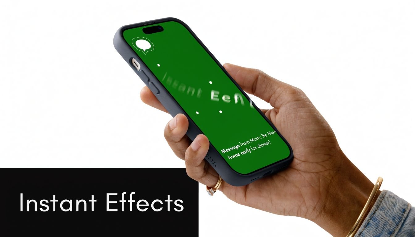
On iPhone
In Apple Messages, type your message, then press and hold the send button. That opens the built-in effect menu. You'll usually see two categories: bubble effects and screen effects.
Bubble effects are better for direct emphasis. They make one message feel louder, gentler, or more dramatic. Screen effects are broader and work better for birthdays, celebrations, or announcements because they animate the full conversation view.
Use iPhone effects when:
- You want speed more than customization.
- The recipient is also in Apple Messages.
- The message is time-sensitive and doesn't need to be repurposed elsewhere.
A practical rule helps here. Short copy wins. One line with a clean intent looks deliberate. Three lines with multiple effects look messy fast.
On Android
In Google Messages, animated behavior depends heavily on RCS being enabled and supported. Some effects are triggered by specific phrases, and some visual behaviors are tied to reactions or richer message features inside the app.
This is useful when both sender and recipient are inside a modern Android messaging setup. It's less useful when you need guaranteed consistency. Phrase-based animations can be fun, but they're not a reliable branding tool because you don't control the experience as tightly as you would with a custom GIF or short video.
What breaks across devices
Most “how to send animated text messages” tutorials stop too early because native effects are not universal.
As noted in a discussion of cross-platform limitations, Google Messages reached 1 billion RCS users by 2023, yet mixed-device conversations can still show broken or static effects because of unenabled RCS or carrier limitations. In practice, that means an effect that feels polished on your phone can arrive as ordinary text on someone else's.
Practical rule: Use native effects for personal chats and quick experiments. Use exported assets for anything tied to a launch, promotion, or brand moment.
A simple way to consider the concept:
| Situation | Best option |
|---|---|
| Friend-to-friend iPhone chat | Native iMessage effect |
| Android-to-Android with RCS active | Native Google Messages effect |
| Mixed devices or brand campaign | Custom GIF or short MP4 |
| Asset you want to reuse later | Custom GIF or short MP4 |
If you want something that survives outside one messaging app, build the animation yourself. That's where dedicated tools start to earn their place.
Level Up With Dedicated Animation Apps and Tools
Built-in effects are quick. Dedicated tools give you control. That matters when you want the text style, timing, background, and export format to look intentional instead of app-generated.
Pick the right tool for the job
Three tool categories cover almost every need.
GIF keyboards and makers like GIPHY are the fastest option. They're great for reaction-style motion, meme energy, and fast production. If your goal is “I need a moving announcement in minutes,” start here. The trade-off is originality. Lots of assets feel familiar because many people use the same library.
Template-based design apps like Canva and Adobe Express are the sweet spot for most creators. You can animate text layers, add a background, control font pairing, and export without learning a motion graphics timeline. These apps are ideal for product drops, course launches, booking notices, and event reminders.
Professional software like Adobe After Effects gives you the highest ceiling. You can build custom kinetic typography, timed transitions, masked reveals, and polished title sequences. It also takes more time and skill. If you only need clean animated text messages, it's often overkill.
For lyric-style text timing, caption animation, or music-led motion, this guide to AI tools for synchronized lyric captions is useful because the same timing principles apply to short promo loops and text-first clips.
GIF or MP4
Choose the format based on where the asset needs to live.
- GIFs work well for simple loops, broad compatibility, and fast reuse in messaging contexts.
- MP4s usually look cleaner for gradients, smooth transitions, and longer motion because video compression handles those details better.
- If the text has tiny details, test both. GIFs can make thin fonts look rough.
- If you want silent autoplay on a page, MP4 is often the stronger visual option.
Here's the marketing reason to care about quality. According to Emarsys SMS marketing statistics, animated MMS messages have an 18% average click-through rate, compared with email's 2.5%. If the channel already earns attention, your creative needs to hold up when it gets opened.
A good export checklist:
- Keep the message short: one idea per animation
- Use high contrast: white on dark, dark on light
- Leave breathing room: don't crowd text against the edges
- Preview at phone size: desktop legibility can be misleading
Here's a useful walkthrough if you want to see motion tools in action before choosing one:
Keep text readable on a small screen
Most weak animations fail for one of three reasons. The font is too thin, the movement is too busy, or the line is too long.
Keep the motion simple enough that someone can understand it on the first glance, without replaying it.
A few design decisions fix that:
- Use fewer words: “Now booking,” “Drop live,” and “Check your bonus” land faster than sentence-length copy.
- Pick sturdy fonts: bold sans-serifs usually survive compression better than decorative styles.
- Animate one variable at a time: movement, opacity, or scale. Not everything together.
- Loop cleanly: awkward resets make a polished graphic feel cheap.
If your asset still feels cluttered, strip away the background first. In text animation, plain often beats busy.
Drive Engagement with Animated Marketing Messages
When people use animated text messages for marketing, the mistake isn't usually lack of creativity. It's using motion with no message hierarchy. The animation gets attention, but the viewer still doesn't know what to do next.

Where motion helps most
Animation earns its keep when the text itself carries the core value. That includes flash-sale headlines, restock alerts, waitlist confirmations, appointment reminders, and short thank-you messages after a signup or purchase.
The retention case is strong. A kinetic typography and animation analysis states that viewers retain 95% of a message delivered via animated video or text, compared with 10% from static text alone. That doesn't mean every text should move. It means motion is useful when remembering the message matters.
Good use cases include:
- Launch announcements: animate the headline, keep the offer static underneath
- Welcome flows: send a short branded thank-you with a clear next step
- Service businesses: explain “confirm,” “arriving,” or “ready” with calm motion instead of extra copy
- Support moments: use a tiny looping explainer when a process confuses customers repeatedly
If you're planning campaigns, this breakdown of MMS vs SMS marketing strategies is worth reading because format choice changes how much creative room you have.
What usually fails
The bad version is easy to spot. Everything moves. The colors fight the copy. The call to action is buried under the effect.
A better structure is simple:
- Lead with the animated phrase.
- Follow with one plain-language benefit.
- End with one action.
That might look like this in practice:
Restock live
Your size is back. Tap to shop.
Or this:
Thanks for joining
Your bonus guide is ready.
The motion attracts the eye. The static line does the selling.
Another common mistake is chasing novelty instead of tone. A luxury brand shouldn't use chaotic meme-style loops unless the campaign deliberately calls for that energy. A tattoo artist, fitness coach, or music creator can usually push motion further because the audience expects personality. Brand fit matters more than technical polish.
Add Animated Text to Your Bio Link Page
A text message is temporary by design. It shows up, gets read, and disappears into the thread. That's useful for urgency, but it's weak for compounding attention.
The better move is to take the animated asset you already made and place it somewhere permanent. A link hub is ideal because that's where all your traffic eventually needs to land.
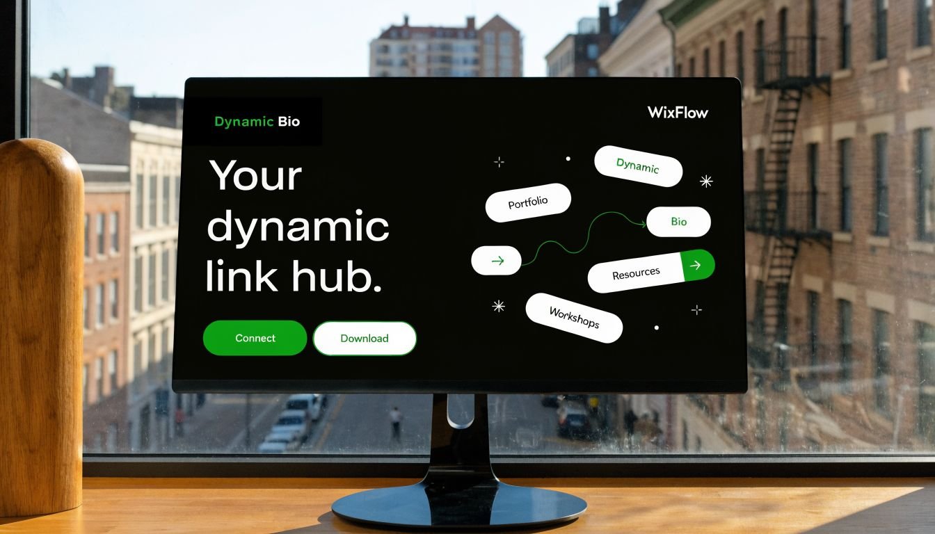
Turn one message into a reusable asset
If you made a looping “New video out now” graphic for MMS, don't let it die in the campaign. Put that same animation above the YouTube link on your page. If you built a “Now booking” text animation, use it as the visual lead-in for your services block. If you created a thank-you animation for new subscribers, reuse the style in a mini welcome banner on your main hub.
Page-level calls to action respond well to motion when it's used deliberately. According to research on animated CTA performance, websites using animated call-to-action elements see click-through rate improvements of 15% to 40%. On a bio link page, that kind of lift matters most on the links tied to revenue or audience growth.
Best placements on a link hub
Not every block needs motion. The best pages usually keep animation concentrated in one or two areas.
Good placements include:
- Header banner: a short loop announcing a release, offer, or upcoming date
- Primary link block: subtle movement around your main action such as shop, book, watch, or listen
- Product or gallery highlight: a lightweight animation that introduces a featured item
- Section divider: a restrained looping label that breaks up long stacks of links
Less effective placements tend to be navigation-heavy areas. If every button pulses, nothing feels important. If multiple animations compete on the same screen, the page starts to look unstable.
One moving focal point is persuasive. Several moving focal points feel accidental.
A clean workflow looks like this:
| Asset you already made | Smart bio page use |
|---|---|
| “New episode” text loop | Place above your podcast or YouTube link |
| “Now booking” animation | Attach to services or contact section |
| “Limited drop” promo GIF | Add near featured product block |
| Branded wordmark loop | Use in the header area |
The hidden advantage is consistency. People who saw the animated text message recognize the same motion language when they hit your page. That continuity makes the brand feel more considered, even if the asset was made in a simple template app.
Best Practices for Accessibility and Performance
Animation can sharpen a message. It can also make a page tiring, slow, or hard to use if you get carried away.
The easiest fix is restraint. Keep motion purposeful, keep loops short, and give static content room to breathe.
Make motion easy to tolerate
Some users are sensitive to aggressive movement. Fast flashes, constant bouncing, and large-screen motion can create real discomfort. Respect that by choosing smooth transitions and avoiding effects that strobe or shake without a strong reason.
A few rules help:
- Prefer subtle motion: fade, slide, reveal, gentle scale
- Avoid rapid flashing: especially for promotional urgency
- Limit loop length: if it repeats, it should feel calm
- Honor reduced motion settings: if your site setup allows it, use reduced-motion alternatives
Protect load speed and clarity
Heavy files undermine the whole point of mobile communication. If the asset loads slowly or looks blurry after compression, the message loses impact.
Use this checklist before publishing:
- Compress exports: especially for looping graphics
- Test on mobile data: not just desktop Wi-Fi
- Check first-frame clarity: many users won't watch a full loop
- Keep most of the page static: motion should support the layout, not dominate it
Strong animated text messages feel intentional. They move just enough, say one thing clearly, and point people toward the next action. That's what makes them useful instead of gimmicky.
If you want one place to turn those animated assets into an always-on destination, Bio Links Page Builder makes it easy to assemble a mobile-first link page with videos, products, galleries, service listings, and your most important calls to action in one clean hub.