
Your brand probably looks polished in one place and slightly off everywhere else.
The Instagram highlights use one set of colors. Your website header uses another. Your bio link page has a different button style, a cropped logo, and copy that sounds like it came from a different business. None of this means your brand is bad. It usually means you've been building in public, making fast decisions, and never pausing to document them.
That's where a Brand Style Guide Template earns its keep. It gives you one practical document that tells you what your brand looks like, sounds like, and how to apply it consistently. For a solo creator, local business, or small online shop, that kind of clarity makes your work easier to produce and easier for people to recognize.
Table of Contents
- Why Brand Consistency Wins and How a Template Helps
- Defining Your Brand's Core Identity
- Assembling Your Visual Brand Components
- Defining Your Brand's Voice and Messaging
- Applying Your Guide to Your OneURL Page
- Keeping Your Brand Guide Alive and Consistent
Why Brand Consistency Wins and How a Template Helps
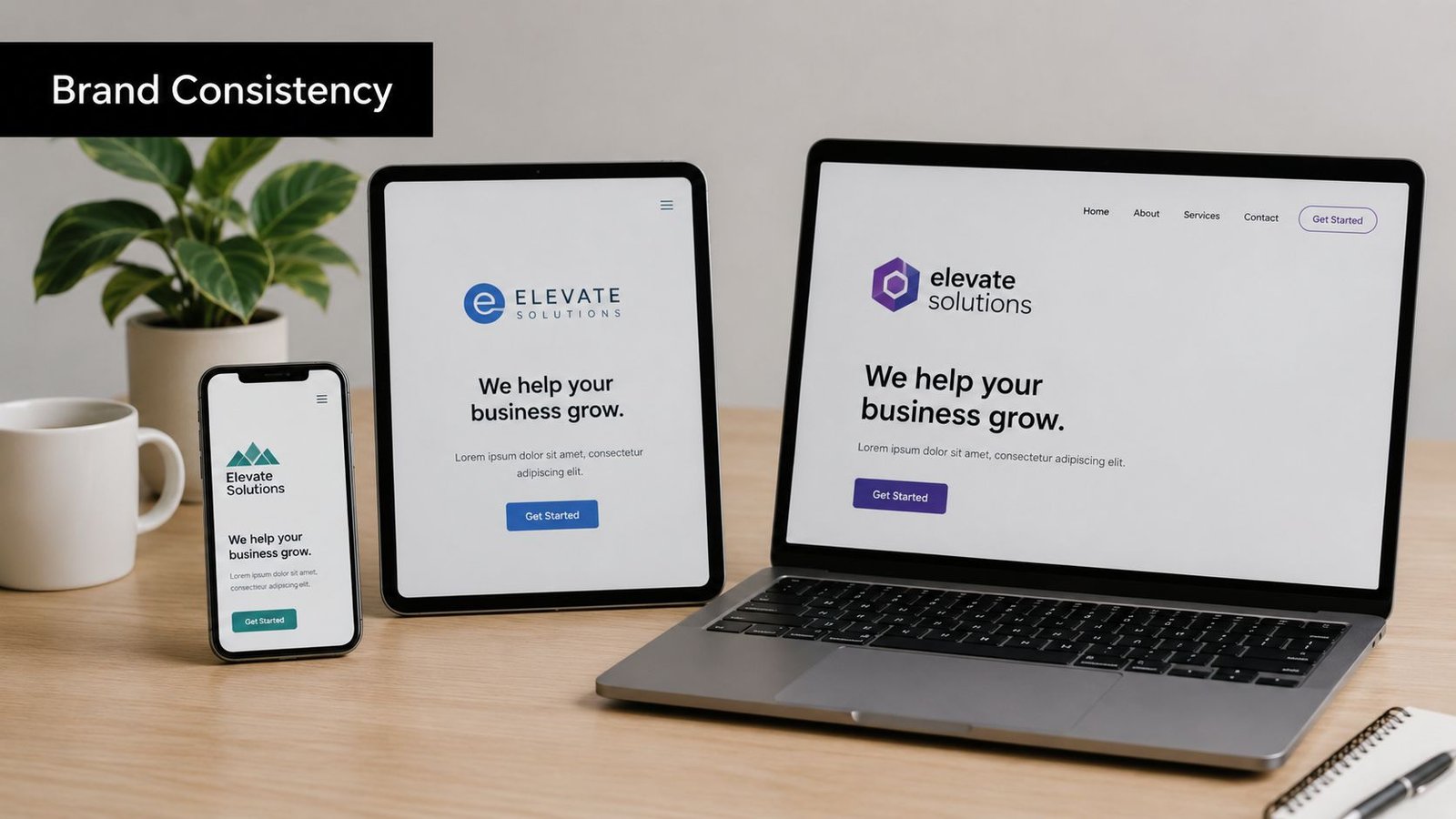
When people move from your social profile to your site to your link page, they're checking whether it all feels connected. If each touchpoint looks unrelated, they have to work harder to understand who you are. That friction is small, but it adds up.
A Brand Style Guide Template fixes that by giving you a single source of truth. Venngage notes that a brand style guide template is a modern standardization tool built on the older need for consistency, and that it bundles the core identity system into one reusable document. In practice, that means your brand story, logo rules, color palette, typography, imagery, and tone of voice live in one place instead of being scattered across old folders, message threads, and memory.
What a template actually solves
Small businesses often assume brand guides are for large companies with internal design teams. They're even more useful when you don't have one. A template helps when:
- You create content quickly: You won't need to rethink fonts, colors, or image style every time you post.
- You hire freelancers: A designer, copywriter, or web developer can work faster when the rules already exist.
- You sell across channels: Print, digital, packaging, social, and landing pages all need the same visual logic.
- You update often: Digital, shareable guides are easier to maintain than static files with outdated rules.
Practical rule: If you've ever said “just make it look like the Instagram,” you need a style guide.
The primary benefit isn't aesthetics alone. It's operational clarity. When your colors are documented, your logo files are organized, and your tone is written down, you reduce hesitation. People know what to use. That makes your brand look more professional without forcing you into a big rebrand.
What works and what doesn't
What works is a guide that's short enough to use and specific enough to enforce. What doesn't work is a beautiful document filled with vague words like modern, clean, bold, and premium, with no supporting rules.
A good template acts like a working manual. It should tell you which logo file to use, which color code to paste, which font weight belongs in a heading, and how your copy should sound when you write a button label or product description.
Defining Your Brand's Core Identity
Before you pick a color palette, decide what the brand stands for and who it serves. Otherwise, you'll end up choosing visuals based on taste instead of fit. That usually leads to a brand that looks attractive but doesn't communicate much.
The core structure of a brand guide has become fairly consistent. This overview of brand guide essentials points to recurring building blocks such as mission, target audience, and tone of voice, and notes that buyer persona fields can include age, gender, and challenges the brand solves. You don't need a complicated strategy deck to use that idea. You just need a written foundation.
Write the mission in plain language
Your mission isn't a slogan. It's a clear statement of what you do, for whom, and why it matters.
If you're stuck, use this fill in the blank draft:
We help [specific audience] achieve [specific outcome] through [your offer or method].
Then tighten it. Remove empty words. Keep the useful meaning.
If you need help articulating your business mission, this resource from Zanfia is useful because it shows how to turn broad intent into a sharper brand statement. For a more complete planning framework, this brand strategy template can help you capture the essentials in one place.
Build a simple audience profile
You don't need a giant persona document. One page is enough if it answers the right questions.
Include these fields:
- Who they are: Role, life stage, or customer type.
- What they want: The outcome they're trying to achieve.
- What frustrates them: The problem they keep running into.
- What they need from you: Speed, guidance, clarity, reassurance, convenience, taste, expertise.
For example, a local photographer's audience profile might focus on busy couples planning a wedding who want a calm, organized experience, not just pretty images. That changes the brand. The visuals can stay elegant, but the messaging should also signal structure, reliability, and low stress.
Choose a personality your audience can recognize
A lot of new brands describe themselves with aspirational adjectives that don't lead to usable decisions. “Professional and authentic” sounds fine, but it doesn't tell anyone how to design or write.
Instead, pick a few personality traits that can shape execution. For example:
- Calm
- Helpful
- Refined
- Direct
Then pressure test them. Ask whether each one would show up in visuals, headlines, customer emails, packaging, and social captions. If a trait can't guide behavior, drop it.
Your brand personality should help someone choose between two good options. If it doesn't influence decisions, it's decoration.
A practical core identity section in your brand style guide template should fit on one or two pages. If it turns into a manifesto, most collaborators won't read it. Keep the thinking deep, but the output usable.
Assembling Your Visual Brand Components
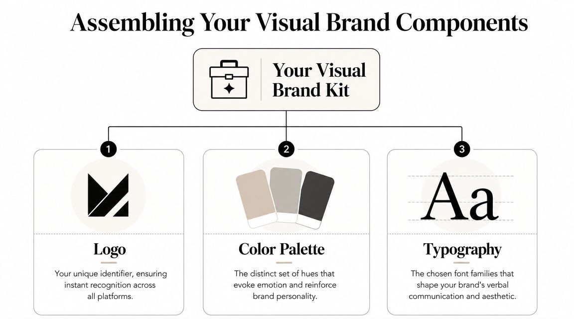
Once your identity is clear, your visual system gets much easier to build. At this stage, many businesses jump straight to mood boards, but mood alone won't protect consistency. You need rules that turn design choices into repeatable actions.
Vistaprint's guidance on building a brand style guide is useful here because it frames the process in a fixed sequence and recommends operational specs such as minimum logo sizes, clear-space requirements, file-type rules like PNG and SVG for digital use, and print fields such as CMYK or Pantone equivalents. That's the difference between a nice-looking concept and a usable system.
Set logo rules before someone stretches it
Your logo needs more than a PNG in a folder named “final-final-new.” It needs usage rules.
Document these items:
- Approved versions: Full color, black, white, and icon-only if you use one.
- Clear space: Define the minimum empty space around the logo.
- Minimum size: Set a smallest approved display size so it stays legible.
- Background guidance: State when to use dark, light, or transparent versions.
- File types: Note which files are for digital and which are for print.
If you skip this step, people improvise. They place the logo over busy photos, export a blurry screenshot, or use a version with the wrong background. None of that is malicious. It happens because the guide didn't answer basic production questions.
Record your color system in usable formats
Color is where many first-time brand guides become too loose. Listing “sage green” and “warm beige” isn't enough. You need exact values.
A practical setup includes:
- Primary colors: The hues that carry the brand most often.
- Secondary colors: Supporting colors used with restraint.
- Accent colors: Highlights for calls to action, labels, or key details.
- Code formats: Hex and RGB for digital, plus CMYK and Pantone or PMS when relevant.
Without precise color definitions, your site, social graphics, print materials, and packaging won't all interpret color the same way. The more precise you are, the less room there is for drift.
If you're also creating print materials, then cross-channel consistency matters most. These brochure design ideas are a useful reminder that layout and print decisions should still follow the same color logic as your digital presence.
Define typography like a system, not a mood
Fonts often get chosen emotionally. That's normal, but it's not enough. A brand font pairing should specify roles, not just names.
Write down:
- Heading font: The font used for titles and major headlines
- Subheading font: Optional if you use a separate style
- Body font: The most readable font for paragraphs and descriptions
- Weights and styles: Regular, medium, bold, italic, uppercase rules
- Fallbacks: What to use if the primary font isn't available on a platform
A common mistake is choosing a stylish display font and then overusing it in body text. Another is forgetting web-safe or digital alternatives. If your chosen typography only works in design files but not on your website or social templates, the system breaks quickly.
| Component | What to Define | Example |
|---|---|---|
| Logo | Approved versions, clear space, minimum size, file types | Full-color logo for light backgrounds, white logo for dark backgrounds, SVG for web |
| Color Palette | Primary, secondary, accent colors plus exact codes | Primary charcoal with Hex and RGB values documented in the guide |
| Typography | Heading font, body font, weights, fallback fonts | Serif for headings, sans serif for body, bold reserved for calls to action |
| Imagery | Photo style, editing direction, subject matter | Natural light portraits, muted editing, uncluttered backgrounds |
| Icons and Graphics | Stroke style, fill style, corner radius, illustration tone | Simple line icons with consistent thickness |
A visual identity works when another person can recreate it without asking what you meant.
If budget is tight, keep the system lean. One logo family, a compact palette, and a reliable font pairing will take you further than a bloated guide full of options no one can manage.
Defining Your Brand's Voice and Messaging
A polished logo won't save copy that sounds scattered. People read your captions, bio, link labels, welcome emails, and product descriptions far more often than they study your logo. That's why voice belongs in the same document as visuals.
Adobe's guidance on brand guides emphasizes that strong templates work as compliance systems, not just asset libraries, and recommends do and don't rules along with explicit tone-of-voice guidance. That's exactly right. Voice becomes consistent when you turn instinct into rules.
Use this not that language
The simplest framework is also one of the strongest. Define your voice by contrast.
Examples:
- Helpful, not preachy
- Confident, not arrogant
- Warm, not sloppy
- Playful, not childish
- Clear, not clinical
This helps because most brands don't fail by choosing the wrong trait. They fail by overdoing a good trait until it turns into a bad one. A fitness coach can sound motivating without becoming aggressive. A consultant can sound expert without becoming cold.
If your brand voice can't survive across a sales page, an Instagram caption, and a support reply, it isn't a voice yet. It's a mood.
Create writing rules people can actually follow
Document a short list of voice rules in your brand style guide template. Keep them concrete.
Try a structure like this:
- Words we use: Friendly, practical language, active verbs, everyday phrasing.
- Words we avoid: Corporate jargon, filler, exaggerated hype.
- Sentence style: Short to medium length, clear first sentence, no overexplaining.
- CTA style: Direct and specific, not vague or pushy.
- Formatting habits: Sentence case, limited exclamation marks, simple punctuation.
Then add examples. Instead of writing “sound approachable,” show the difference.
Do: “Book a consult”
Don't: “Take the next step on your impactful journey”
That level of specificity is what makes the guide useful for collaborators. It also helps you stay consistent when you're tired, rushed, or switching between platforms.
Applying Your Guide to Your OneURL Page
At this point, the guide stops being a document and starts doing real work. Your link page is often the first branded destination people see after social media, so it should feel intentional. If the colors, typography, logo, and messaging all match your guide, the page feels like part of the same brand instead of a disconnected utility page.
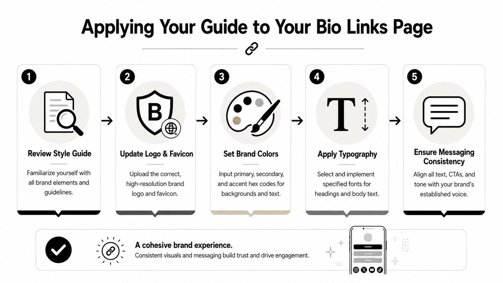
A common issue with style guides is usability. Canva's guidance on visual style guides stresses that guides should be practical, shareable, and useful across touchpoints like websites and social media. That matters here because a bio link page is exactly the kind of touchpoint where branding often gets skipped.
Start with the assets you already defined
Open your guide first. Gather the files and values you need before you touch the page editor.
Prepare:
- Your approved logo files
- Your primary and secondary Hex codes
- Your font choices or closest platform equivalents
- Your short brand bio
- Your preferred call-to-action phrasing
If you're using a builder such as OneURL page builder, this prep saves time because you can move through the settings once instead of guessing as you go.
A short walkthrough helps before you start making changes:
Apply colors typography and layout choices
Go into the design settings of your page and work top down. Don't jump around.
Use this order:
- Upload your logo first: Add the approved version with the right background treatment.
- Set the page background: Use your primary background color or a neutral from the guide.
- Style buttons and links: Apply your accent or action color consistently.
- Adjust text styling: Choose the platform font that most closely matches your brand typography.
- Check spacing and shape choices: Rounded buttons, sharp corners, shadows, and card layouts should all reflect the same brand personality.
What works is restraint. A link page doesn't need every brand color or every font variation. It needs a clean translation of the system. If your guide is elegant and minimal, your page should not suddenly become loud with gradients and mixed button styles.
Match your copy to your brand voice
Now edit the words. Here, many pages still look branded but sound generic.
Review:
- Your bio line: Does it describe what you do in the same voice as your website?
- Link labels: Are they specific, consistent, and easy to scan?
- Calls to action: Do they match your tone, whether that's warm, direct, playful, or refined?
- Descriptions: Are they short, useful, and aligned with the verbal style you documented?
For example, a calm service brand might use “Work with me” or “See available services.” A more energetic creator brand might use “Watch the latest video” or “Shop the new drop.” Both can work. The point is alignment.
This same discipline helps outside the page too. If you're creating offline materials, event kits, or creator packages, it's worth learning the basics of strategic custom swag planning so your physical touchpoints stay consistent with the digital ones.
Keep your link page honest. If the rest of your brand is clean and focused, the page shouldn't read like a crowded marketplace.
When you finish, preview the page on mobile. It's the primary viewing platform. Check logo scale, button contrast, text readability, and whether the page still feels like your brand at a glance.
Keeping Your Brand Guide Alive and Consistent
A brand guide isn't finished when the document looks nice. It's finished when people can use it without asking follow-up questions, and even then it should stay editable.
The strongest guides behave like working systems. They're updated when the business changes, when a new touchpoint appears, or when repeated mistakes reveal a missing rule. If a freelancer keeps using the wrong logo version, the problem usually isn't the freelancer. The guide probably didn't make the right choice obvious enough.
Treat the guide like an operating document
Review the guide when something meaningful changes, such as a shift in audience, offer, channel mix, or visual direction. You don't need a full rebrand every time your business evolves. Often you just need to clarify a few standards.
Useful updates often include:
- New applications: Social templates, packaging, sales decks, event signage, or a bio link page
- Revised messaging: Sharper headlines, updated service descriptions, clearer calls to action
- Expanded assets: New logo lockups, seasonal image rules, or additional icon styles
- Governance notes: Who approves edits, where files live, and which version is current
Share it in formats people will use
A guide hidden in a desktop folder won't protect your brand. Make it easy to access and easy to skim.
A practical setup includes:
- One full guide: The complete reference document
- One quick sheet: A one-page summary with logo files, color codes, fonts, and voice reminders
- One shared location: Cloud storage or a shared workspace where the current version always lives
- Editable source files: Canva, Figma, or Google Slides, depending on how your team works
That last point matters more than people think. If the guide can't be updated centrally, old versions start circulating. Then the same brand slowly splits into several versions of itself.
A good Brand Style Guide Template doesn't lock you in. It gives you enough structure to stay recognizable while leaving room to grow. That's the balance most small brands need.
If you want a fast place to put your new brand guide into action, Bio Links Page Builder lets you create a branded link page with customizable layouts, multimedia blocks, and design settings you can align with your logo, colors, and messaging. It's a practical next step when you want your audience to see a more cohesive brand right away.